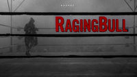
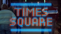
Dan Perri is as he describes himself: a filmmaker born and bred. Although credited primarily as a title designer over the course of his nearly five-decade career, Perri’s contributions to cinema as a whole are undeniable. As a designer he has had a hand in some of the most iconic and important moments ever put to celluloid.
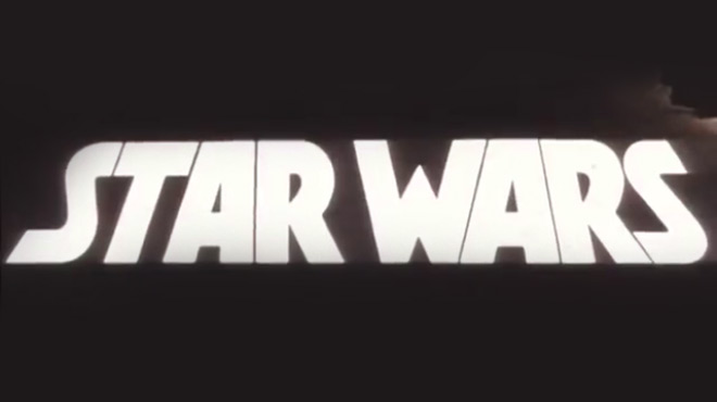
A legend in the field of optical title design, Perri is perhaps best known for a creating the opening crawl that triumphantly heralded the arrival of Star Wars. It’s one of the most identifiable and imitated pieces of title design ever created.
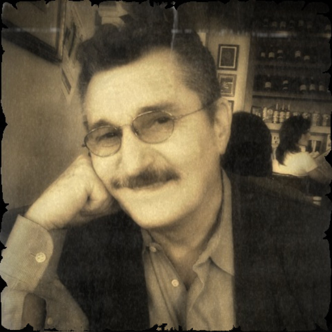
Title Designer Dan Perri
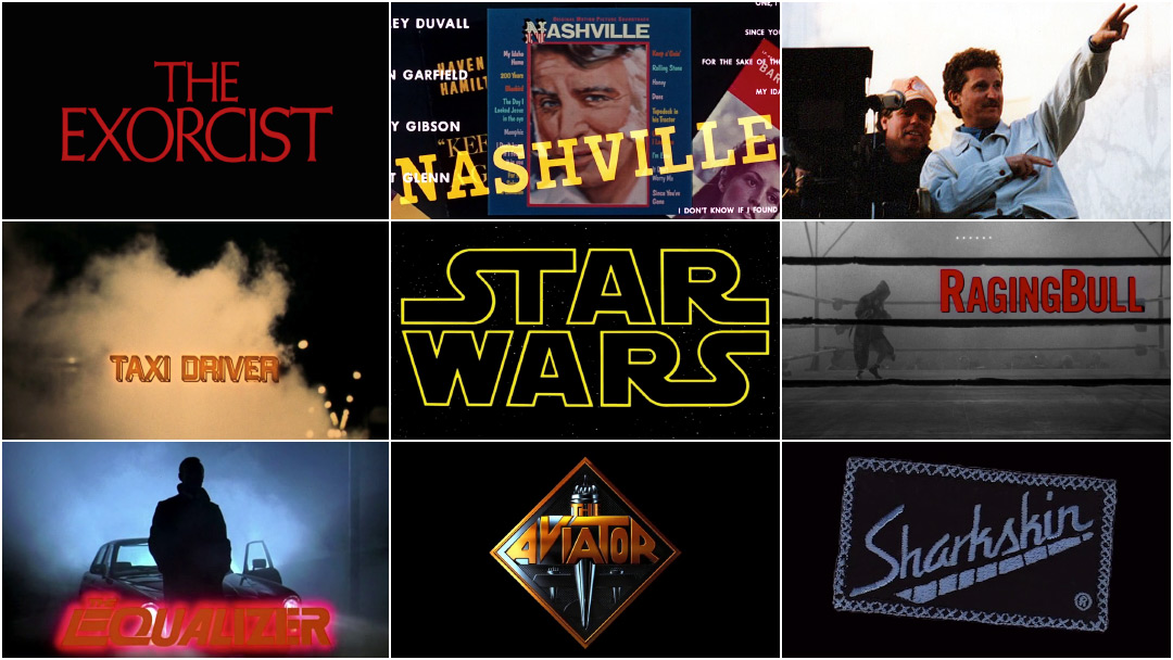
But to only focus on a galaxy far, far away when discussing the career of Dan Perri would ignore a wealth of incredible work, from The Exorcist to Nashville, Taxi Driver to Raging Bull, Days of Heaven, The Warriors, Caddyshack, A Nightmare on Elm Street, Blood Simple, Insomnia, The Aviator, and hundreds and hundreds more. You probably didn’t know Perri’s name until now, but if you’ve seen a film made in the past fifty years then you are already well acquainted with his work.
Unlike some title designers whose style is instantly recognizable, the true strength of Perri’s output is not a familiar design style, but his adaptability – it’s how well suited his title designs are for each project. If there’s one single thing that defines Perri’s career it is that dogged pursuit of good design in whatever form is required. His designs – as varied as they are – have become synonymous with the films for which they were created, but not his name. If he’s done his job right, then the viewer shouldn’t even know who designed the titles until they see “Title Designer: Dan Perri” in the end credits.
In this feature retrospective, Perri shares a selection of stories spanning his incredible design and filmmaking career, from his humble beginnings as a sign painter and the influence of a high school teacher, to being a mentored by design legend Saul Bass and his collaborations with filmmakers like William Friedkin, Robert Altman, Martin Scorsese, George Lucas, Christopher Nolan, and Jodie Foster, as well as the challenges of bringing his feature film and upcoming book on title design to life.
The Beginning
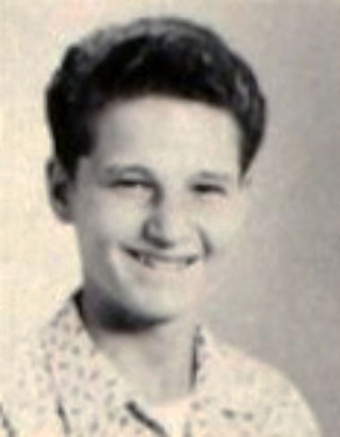
Dan Perri as a teenager
So let’s start at the beginning. Can you give us some info on where you’re from and how you started out?
Dan: Sure! I thought about all this as I was preparing my book. I sort of went back in time in my memory and it all came back to me.
It all started when I was about twelve. My cousin and I started a little business where we were sign painting, on Long Island, a small town there. I was painting the signs and he was selling them to local markets and stores. We were doing signs that would be “potatoes 49 cents a pound” and what not. They would tape it to the window of the little market in the town. We soon started doing more sophisticated signs for bars and restaurants with illustrations and symbols of cocktail glasses and stars and other graphic shapes.
You started off in New York, but you’ve lived in Los Angeles for much of your life. When did your family make the move to LA? What was the reason for the move?
Dan: My father had wanderlust. His mother and his stepfather had moved to LA and he was close to his mother. The story in the family was that he just wanted to be near to her, so he convinced my mother to move to LA. The first time was in 1949 when I was 4 years old. We drove across the country in a little Chevy sedan with a trailer full of furniture behind us. It took a week to travel across country on Route 66. Once we started living there my mother hated it. She really let him have it about wanting to move back. Then finally after a couple of years we moved back to New York, same way with the car and the furniture behind us. After a few more years he convinced her to move back again and we did this three or four times. With a newer car every time, but the same drive. It was very chaotic, our whole early life was that way. Eventually my parents were divorced and I lived with my mother. She was an artist, so I had the experience of learning art from her. She validated all that I did. It made it something valuable because she was overseeing it. I think because I found design and art I sort of retreated into that.
So did you continue your sign painting business after you settled on the West Coast?
Dan: Yes, I started painting signs all over the valley here in the LA area. I would go to a car wash on Saturday morning and paint the prices on the windows. I had three or four lots regular so I would make like 75 cents a window and I would make myself fifty, sixty, or eighty bucks every Saturday.
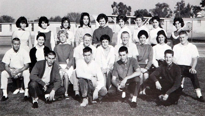
Dan Perri (bottom right) in high school, 1962
Dan: I'd come by and knock them all out with my little paints and brush and then come back the next Saturday and they’d give me new ones. I was doing quite well for freelance, running the business myself and making quite a bit of money as a kid.
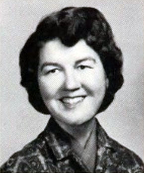
Teacher and former art director Barbara Brooks
Very entrepreneurial! So when did your formal design education begin?
Dan: When I was in junior high school I was fortunate to have an art teacher, Barbara Brooks, who had been an agency art director. She and her husband were working on Madison Avenue in New York for major agencies, and when he died she went into teaching.
Barbara taught a number of different art classes and in one of them we did posters for all the school activities. If there was going to be a dance in the gymnasium that weekend, we would do posters to advertise it. So the idea of working in the advertising world happened very early for me. She being had all this experience and information and knowledge about that world. I became so obsessed with it, I studied all the design manuals that she made available to us. I knew all the designers and what they were doing, and what agencies had what accounts.
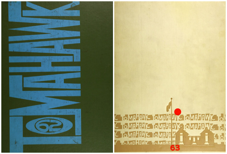
Birmingham High School yearbook covers designed by Dan Perri in the early 1960s.
Dan: She exposed us to all the books, the annuals, and the various publications within the advertising business. Graphis magazine, Communication Arts, and one or two others. I studied them like a bible. I was virtually an encyclopedia of the advertising world. I was fortunate to have her as an instructor. By the time I graduated high school I was way ahead of anybody I was working with when I went to Art Center in Pasadena.
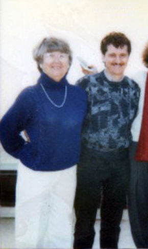
Barbara Brooks and Dan Perri in the early 1980s.
It sounds like she was a very big influence on your design thought and education...
Dan: Yes, she was. She lived across the valley and she used to invite her favourite students up to her house. We used to have dinner and she’d entertain us and tell us stories. I loved going there because it was this special place where we could talk about the things I loved. Later, I bought that house from her and lived there for many years. I remained in touch with her. By that time she’d moved down to the beach, so I used to go down to the beach every few weekends, visit with her and spend the whole day talking about art of various kinds. So yeah, it was a very special relationship. She was really a wonderful woman. She died a good many years ago now and I still feel the loss. Her guidance and advice was so important to me.
Art Center, Advertising, and Meeting the Master
So you’re in high school, you’re sign painting, and designing posters and yearbooks, you’re learning about the world of design and advertising. What came next for you?
Dan: By this time I was competing in all the city-wide poster contests. There were a lot of them at that time here in LA. The city would sponsor it and then the winners of the poster contest would be put onto the sides of garbage trucks, billboards all over the city, and anyplace else that they could be posted. I won all the contests my senior year in high school. One of these contests was judged by an agency art director who headed an ad agency on Wilshire Boulevard, which is the equivalent here in LA of Madison Avenue, call Hixson & Jorgensen. I hustled him for a job and became the apprentice to the art department at this national agency.
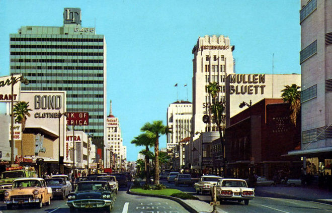
Wilshire Boulevard in Los Angeles in the early 1960s
Dan: We did ads and TV spots and so on for Voit Rubber and Lincoln-Mercury and a lot of other major accounts. I worked with all of these art directors, writing copy and doing paste up, working on design and lettering and so on. Then after that summer I started studying at the Art Center College of Design here in Pasadena. One of my agency art director friends was one of my first advertising design teachers, so I was operating on a very high level in my studies.
So you started at Art Center and were on a path into a career in the advertising industry?
Dan: I wanted to be an agency art director, but I was always doing graphic design as well along with it. At that time the Art Center School, as it was called then, was a graduate school – I didn't know what that meant but I learned about it from my teacher in high school. I told her I wanted to go to school there, so I went and applied. Little did I know that at that moment in time they were considering an undergraduate department where they would offer a bachelor's degree. So I applied and I became one of twelve high school students, the first wave of high school students that were accepted to Art Center. Suddenly I was staying with all these adults when I was eighteen years old! All these adults were there who were graduates from other colleges and were now studying graphic design, photography, advertising design, and so on at this graduate level. I was this kid running around playing football on the lawn during lunchtime, studying beside them. So I was competing with all these professionals at that time when I was eighteen.
What year would this have been?
Dan: That was 1963 or ‘64. I graduated high school in ‘63, started there the following Fall. I went there for a year and a half before I lost my scholarship. I was still a kid and I was goofing off. I wanted my summers to play because that's what I was used to up to that time in my life. So I stopped going to the Art Center and I went to a local college where my art teachers there basically told me, “There's nothing we can teach you. Just do whatever you want.” But I continued studying and doing graphic design, sign painting, and freelance graphics. I was doing record album covers for small record companies and other graphics for companies. I would do their stationery, logo, and any graphic material they needed – posters or brochures or mailing pieces and so on. I had a little business. I had a little office outside of my home. I was just building up a clientele and then I met Saul Bass.
If you had any interest in graphic design, you were aware of Saul Bass.
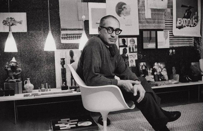
Saul Bass in his office, circa 1960
Were you already familiar with his work at that point?
Dan: If you had any interest in graphic design, you were aware of Saul Bass. I had always admired him from my high school days. I knew of all his work from the magazines that I’d read. In Graphis you could see all the work of the European designers from Germany and Italy and France, and get a bigger view of the things that were being done. Logo design, advertising, collateral material, and what not. Saul Bass’s work was in Graphis, as well as CA. I liked the stuff he did because it was so graphic. It was right up my alley. I’d been painting signs for many years, hand lettering with paint and a brush, and then I started designing those letterforms into shapes and logos. Saul was a big designer of logos, so I started to see a connection.
Did you know his title design work as well?
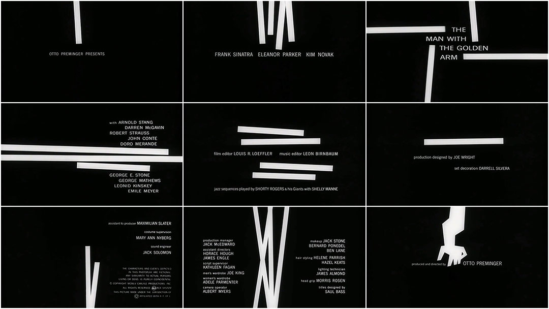
Dan: Of course I saw all those Hitchcock sequences that Saul Bass did, like Walk on the Wild Side, the classic one with the cat. It wasn’t contemporary at the time, but The Man with the Golden Arm, Advise and Consent, and Bonjour Tristesse all had that same graphic quality. Golden Arm was ‘57, so I was 12 then.
The Man with the Golden Arm (1955) title sequence, designed by Saul Bass
Dan: Even then I just wasn’t aware that someone did that, that there was someone who specialized in doing that. I just thought it was the director. Did he set the type? I don’t know, I never thought about it. But I’ve had a lifelong love of type, so I always appreciated what I was seeing on the screen and how unique it could be. I probably didn’t notice it at the time but I would have later when his work was put into magazines. That’s when I became aware of his body of work. Then of course he was creating new work all the time, mostly corporate logos.
So how did you first meet him?
Dan: I learned his offices were right here in LA on Sunset Boulevard. I sought him out and began kind of, well, it’s known now as stalking. The man that I admired most was right here and I couldn't stop myself. I was persistent.
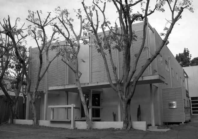
The Bass/Yager & Associates office at 7039 Sunset Boulevard in LA. Photo by Ron Gilbert.
Dan: I started going down to his office and I would just walk in, announce myself, and ask to see him. I'd sit waiting for hours sometimes to see if I could talk to him or say hello if he walked by. He usually wasn't available because I had no appointment. Then they started sending me to his right hand man, a guy named Art Goodman.
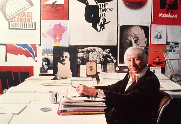
Art Goodman in his office, 1978
I learned later he was a very talented illustrator and all those drawings that were in many of Saul’s graphic posters were actually Art’s drawings. So every time I would come in to try to see Saul, they would send me down the hall to see Art. Art became familiar with me. We’d chat, he’d look at my portfolio, encourage me, and comment on my new work. One day he finally said, “Come on,” and took me down the hall to Saul’s office and said, “Saul, I think you should see what this young guy’s got.” At that point Saul kind of took me under his wing and began mentoring me. Then I’d have to come see him every couple of months to show him what I was doing, as I was learning more and doing independent work.
It was around this time that you ended up in the Navy, right? What kind of work were you doing in the service?
Dan: I did a lot of graphic design and artwork when I was in the Navy. I was a journalist on the ships I was on. There was a billet as they called it for one journalist. So I’d be running everything that was journalistically oriented on the ship. The aircraft carriers I was on, two different ones, and the USS Repose, the only hospital ship in commission at that time left over from WWII, all had daily newspapers, so I was the editor by default. It was just me. I designed a masthead for this paper, that I called The Repose Reprise.

Dan Perri aboard USS Repose in the mid-1960s
Dan: I used to gather the news by going up to the radio shack and they had a feed from the AP and UPI. They had all the news on these teletype machines. They would just chatter away and all these stories from all over the world would come out on these rolls. I’d take these rolls back to my desk, decipher it all, type it up on a matrix and handprint with a mimeograph machine these blue ink newspapers. I designed it on legal size piece of paper. You fold it in half and you have a four page paper. Front page was hard international news, inside was stories from around the US, then the back was sports. I had clip art of drawings and various things, so I’d put a comic book or a joke on the back. I’d also put pictures of women in different scantily clad costumes in there every day. I built these little cardboard boxes that I’d mount to bulkheads around the hallways on the ship which became newsstands. I’d print up three or four hundred of these things, fold ‘em by hand, and then go around to these newsstands and stuff 50 or so into each of these boxes. The guys around the ship were always waiting for them. This was their connection to the world. They got their news from me, so it was a very rewarding job.
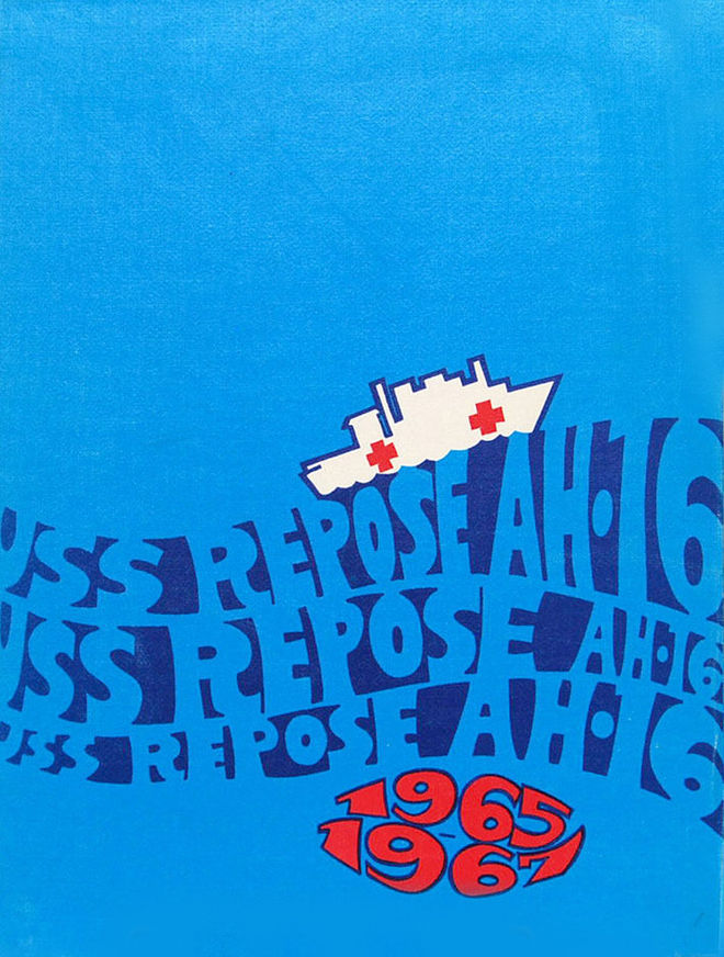
USS Repose cruise book cover designed by Dan Perri
I was also a ship’s photographer when I was on the hospital ship. There was hundreds of beds full of wounded marines from the war. I had to take pictures of the captain and all his guests. Different entertainment troupes would come on board. Bob Hope came on board with his travelling show with different actors and comedians. Raymond Burr, the actor from Perry Mason, he came on board and it was my job to show him around and to photograph them. The captain would invite them to his cabin for lunch and I’d have to move around the room and take pictures of everybody. I’d then have to go develop them and make 8 x 10 prints for the captain, so he could have a memory of all these events.
I did that for almost a year while I waited for my transfer to journalism school. After journalism school I was assigned to the aIrcraft carrier USS Independence, as ships journalist. I ran the on board CC TV station. So I had really good duty, but I was on ships so I was sick all the time. I was the first guy in the sickbay every morning to get my dramamine. I was sea sick the whole year. Every single day I lived on those dramamines.
Title Design by...
After your stint in the Navy, what came next for you?
Dan: At that time Saul had just designed the Bell Telephone logo and he was staffing up with designers to apply the logo to the hundreds of areas they needed it on. The helmets, the trucks, and so on. He was actually hiring three full-time graphic designers just to do the Bell Telephone work and he wanted me to work for him, but it set off something in my head where I got this burst of ego and I thought, "Well, if Saul Bass wants me I must be good enough!" So I turned down the job and accelerated my work pursuing graphic design and advertising design. At around the same time I ran into my old friend from high school, Steve Smith.
If Saul Bass wants me I must be good enough!
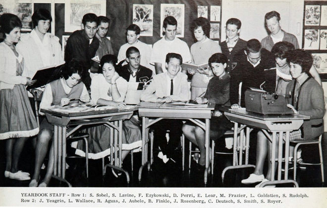
Birmingham High School yearbook staff photo featuring Dan Perri and Steve Smith, 1963
Dan: We were competitors in high school and design work. He was working for an optical effects company, which at the time is the place where all of the titles were put together. There were a half a dozen or so in Hollywood and one of the known designers at that time who did titles was working out of that company. Whenever he would get a job he would bring it there and they would produce it. My friend Steve would do the artwork with this designer.
What was the name of the company and who was the designer?
Dan: It was called Cinefx and the designer was Phill Norman, who did a lot of work for a number of years. Phill came out of one of the other optical companies, as did Wayne Fitzgerald, as I’m sure you know as well. Wayne worked at Pacific Title for many years and had some of the producers as his clients. Whenever one of them would bring a job into Pacific, Wayne would handle it. He'd design it and represent Pacific to the customer, so he was a contact man. He did hundreds of designs before he left Pacific and became an independent designer. Wayne was now on his own and was working with major producers and major studios.
So it was Wayne and Phill, and then another guy I started working with whose name was Don Record. Don had only worked for maybe five or six years and he had a group of clients as well. He was kind of high powered and had aspirations to do ad campaigns and trailers and direct eventually and so on, and so I joined his staff after Steve. I worked with Record but I left after about a year of him exploiting me and taking credit for my designs. Then Steve and I hooked up and opened a little company right down the street from Don called Perri & Smith. Steve and I were in business together from ‘69 and then in ‘73 I did The Exorcist and that was the picture I did on my own after Steve and I broke up.
What can you tell us about your work with Steve as Perri & Smith?
Dan: We did a lot of small, low-budget things, independent features and TV. The most common work was with David Wolper, who was a big time documentary producer at that time. He had a big staff and owned the whole building where they were cranking out TV shows for syndication and we did a lot of work with Wolper. We did get a couple of credits and the last one I think we did together was called Electra Glide in Blue for United Artists.
Electra Glide in Blue (1973 main titles, designed by Perri & Smith
Dan: We also did a number of films for Gene Corman, Roger Corman's brother, who had a contract with MGM to do black exploitation films. So we did five or six films. I was the designer and Steve was the producer because he knew how to prepare artwork for the screen and I didn't know how to do that. I knew how to design and invent ideas and concepts but I didn't know how to put them together. While I was with Steve I learned how to do that. He was the producer of all my work but we got credit for it together. We did a number of low-budget films and often times we got stiffed by the producers who either wouldn't pay us or paid us less because we had no power. We had no reputation, we had nothing. We'd take jobs anywhere we could find them so often times it was with these shyster filmmakers who were working on shoestring. We'd wind up getting stiffed because by the time they got the titles they had no money left. They would take advantage of us.
The Exorcist (1973)
The Exorcist (1973) main titles, designed by Dan Perri
Electra Glide was right before you did The Exorcist, right? How did you go from working on docs and B movies to one of the biggest blockbusters of the 1970s?
Dan: It happened that the sound was particularly good on Electra Glide in Blue. The fellow who did the sound, Jimmy Nelson, became one of my best friends. He was an award-winning sound editor and had a sound company. Jimmy had done the sound on Electra Glide in Blue and I learned later that Billy Friedkin was preparing to do The Exorcist and was looking for a good sound man. He went to see Electra Glide to see Jimmy’s work and in the process saw some of my work for on the titles and he hired me to do The Exorcist. That was one of the first big blockbusters that would knock the socks off all the box office records.
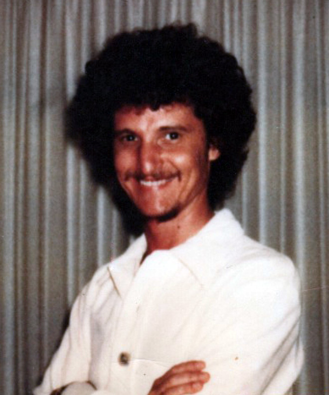
Dan Perri in the early 1970s
Friedkin has a reputation as being hard to work with. How was your working relationship with him?
Dan: I didn’t know that until the day I went to the dubbing stage where he was doing the sound mix. Usually on every film I would catch up with the director and meet with them when they were doing sound, doing music recording, or in some phase of post production. It was common for me to come in and wait for the director while he was doing a take, mixing a moment or adjusting the sound levels and what not.
So I’d come in and wait for Billy. He was always happy to see me. He liked what I was doing when I’d show him stuff. One day when as I was walking out one of the assistant editors came running up to me and said, “Oh, Billy wants you to come back in, he’s got something to say to you. We’re always glad when you come. He’s always yelling and screaming at us. When you’re here he’s so nice to you and so nice to us, and the minute you leave he goes back to being a monster!” [laughs] They weren’t describing the person I knew. He treated me very differently.
It seems like the film was a big turning point for your career...
Dan: The Exorcist hit big in the fall of ‘73. When you're associated with a hit your career is just kind of set. All of a sudden I was getting calls from people because they saw my name on the screen. I could call any producer and say let me do your film and they'd say “Well, what have you done?” and I'd say “Well, The Exorcist.” Then it was “Come on over!” It was amazing at that time, things were so easy and productive and exciting. Suddenly I was working with all top directors. They would pass me around from one to the other.
Nashville (1975)
Nashville (1975) main titles, designed by Dan Perri
Speaking of major directors, you started working with Robert Altman shortly after The Exorcist. How did you get involved with Nashville?
Dan: There’s a story to that opening. I met Bob Altman on his previous film, the gambling film California Split. Bob had called me up and said, “Hey, you know I really like your work. You were doing a picture with a friend of mine so I asked for your phone number.” So I came over and did California Split with him. He was just growing in his stature at that time. He was preparing Nashville, he’d just done McCabe & Mrs. Miller and so on. He was getting financing from any studio he wanted to go to.
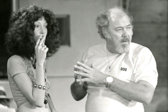
Shelley Duvall and director Robert Altman on set of Nashville, 1974
Dan: Basically he wanted me to become part of his company – just go out of business and work for him. He said, “You work for me and you do all my pictures.” I said, “I don’t know, I work with too many big guns, I don’t want to lose that!” So he said, “Well, then just move in over here. Be close to me so that I can have access to you.” He had this wonderful one story building on the corner of Westwood Boulevard, right off Wilshire. It was this charming old building that had been built in the 1920s — it had all this architectural history to it and these lovely walkways in the middle. He gave me the front, top and bottom, of that building. It was just the best! It had a view of the street and it had a pinball machine in that front room – Bob would come down and play pinball all the time. We’d talk and play pinball.
That sounds like a very nice arrangement!
Dan: So I became his visual consultant. Anything visual on any of his films, whether he was in post, preparing or writing something, he would always bring me in to meet with his Director of Photography, his production designer, his costumers, and he would just ask my opinion. So I was part of his core team.
Do you remember your first conversations with Altman about the Nashville opening?
Dan: He was in Nashville shooting it and then he came back to Los Angeles to start editing. Without seeing any of it, he said, “Give me a logo that we can use for the movie, the ads, and everything else.” I just thought I’d design all these really elegant, handsome, beautiful type treatments to use. They were all really nice, but when Bob looked at them he hated them all. He said, “These pieces are all wrong! You should just go to Nashville to see what a junkhole it is. Everyone’s just fighting and backstabbing to get ahead in the music business!” And I said, “Well, just let me see the movie!” [laughs]
So, once I saw the movie I realized the whole thing really needed to be dumbed down and made to be junky and loud and in-your-face, all those qualities that the city has. So that’s when I came up with the idea of doing this TV commercial for the opening. At the time the local stations here in Los Angeles ran these old movies, old TV series’, and all these commercials for raunchy products. A lot of these were those K-tel Records ads selling compilation albums, old rock ‘n’ roll from a bunch of different bands. And the commercials were just like yelling “YOU GOTTA BUY THIS! IT’S THE BEST THING EVER!”
K-tel Records '22 Countrypolitan Hits Original Stars ' commercial
That’s one way to get the viewer’s attention! [laughs]
Dan: Yeah! They were exactly 60 seconds because that’s all the airtime they bought. So I wrote this diatribe, this rant based off of the record commercials, and I hired the announcer who’d done them, Johnny Grant, to do the high-powered narration from my script. We really had fun laying that down. Once I had the voice in place it just motivated the cacophony of images. The painting is the main ingredient of the album cover, which I move in on and move all around on. It’s all the same image and I really dove in and tried to use every square inch of it! There was a roll up and a roll down going simultaneously, images popping on the screen and sliding in.
Taxi Driver (1976)
Taxi Driver (1976) main titles, designed by Dan Perri
Since you did the titles for both Taxi Driver and Raging Bull, people often closely associate your work with that of director Martin Scorsese. How did you first come to work with him?
Dan: The first picture I did with Scorsese… He wanted me for Alice Doesn’t Live Here Anymore, but he couldn’t hire me because I wasn’t known at the time. When he took my name to Warner Bros. they said, “Who’s that?” and they wouldn’t let him hire me. So he promised that I could do his next film, which was Taxi Driver.
What was the original concept for that sequence?
Dan: Taxi Driver was primarily over backgrounds but I took those second unit backgrounds and first I cut them. I chose the shots I wanted like 200,000 feet of second unit and then I did effects with them. I wanted to do something to capture the underbelly of the world that the character lived in.
I found this effect that I could use by copying the live action backgrounds from a colour print rather than from the interpositive. The IP, as it was known as, reproduced the background as it looked from the original photography. You maintain the colour balance and the quality as much as possible but it’s still a dupe. When you’re making an IP from the negative and then you copy from the IP onto a dupe negative, you gain contrast and you gain grain. When you copy from a colour print though, you get very saturated colours and the blacks are real black because the print is holding out light. When you’re exposing black from a colour print onto to new negative, there’s no light that goes onto to the film from the colour print because it’s holding out light. So the black is very black, the colours are very saturated. The reds are real red, the blues are real blue and so on. So when I chose to copy the live action from a colour print, it became a graphic sequence.
How did you achieve that streaking effect?
Dan: The sequence ends with the taxi driver stopping at a stop light and it’s from his POV. People were walking across the street in slow motion and they’re oddly out of their element because it’s not a real world. It still a surreal world. There was a process or an effect which became known as slit-scan. I knew of this slit-scan effect and I kind of adapted it for that one scene where everything is blurred, there’s that streaking effect. What I did was copied the shot from colour print and then wind back and adjust one frame later and then I’d copy it again. There’s twelve passes on that so it gives it a streaking effect. The lights are trailing and it created this wonderful effect that was kind of an unnerving mood that the character was feeling, the weird world he lived, this kind of horrific, scary place to be in. It brought me into the editorial world to some extent, where I was now designing and choosing to do things that would reflect the character. I was commenting on and helping to illuminate the character to the audience.
Star Wars (1977)
Star Wars (1977) opening crawl, designed by Dan Perri
Many people know you as the person responsible for designing the famous Star Wars opening crawl. How did you get involved in that film?
Dan: In this case, the post-production was so complex — it had never been that bad on any film — that my friend Jim Nelson was hired to post-produce Star Wars. He was what is now commonly known as the post-production supervisor. He would often promote me for jobs that he was working on. He recommended me to George Lucas. After they moved the production of Star Wars to Tunisia, they rented this big warehouse in Van Nuys, which is outside of LA, out in the San Fernando Valley. That’s where Industrial Light & Magic (ILM) began, in this warehouse in Van Nuys. They were shooting all the plates and all the effects and designing cameras, camera stands, and so on. John Dykstra was overseeing all of that.
What was your first meeting with Lucas like?
Dan: I was called out to Van Nuys to meet with Lucas. We started talking about some of his ideas and he wanted me to see a lot of the old serials from the ’30s and ’40s, the Buck Rogers films and other space characters and adventures. He hired me and then I started going out there every few days whenever I had something new to show him, which he usually hated! He didn’t like anything I was doing…
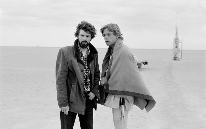
Director George Lucas and Mark Hamill shooting Star Wars on in Tunisia, 1976
Really? You hear stories about how stressed he was during that time…
Dan: To say the least. He was under enormous pressure. I would bring what I was working on to George and I’d sit and wait for him for hours to show it to him. I’d sit and watch dailies with him or go to meetings with his guys. He had a lot of old films, 16mm, he had a projector in there. We’d watch Buck Rogers and Flash Gordon and glean things from that. Finally, he would have a few minutes for me, he’d look at it and wouldn’t like it, then he’d get pulled away by something else and come back a few days later. This went on for two or three months until finally I hit on something he liked.
And what was it that he liked?
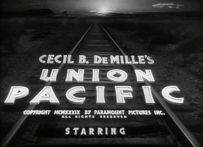
Dan: I came across this film called Union Pacific, which is just a basic film about the railway and people fighting over land and so on. A regular cowboy Western. But the main titles were looking down the tracks and these titles rolled towards you along the tracks, as if there was a train, or rolled away from you, I forget which it was. But I got an idea. I saw this motion of the titles rolling away from you into space towards a horizon line. So George liked that.
Union Pacific (1939) main titles
How did you move forward from there?
Dan: I began developing ideas and setting guides and text in different ways. I would shoot something on high contrast, just black-and-white film in motion, and shoot 30 seconds or so to show the artwork, which was on a big piece of cardboard, like three feet by six feet. It was mounted to a thicker board and on a hinge. I could tilt it different angles, shoot it in reverse — pulling away from it on this big camera stand with wheels — and make one take. It was a combination of moving the camera and moving the art. The idea was that the titles would be in perspective and that they were being pulled in by the logo. It motivates the entrance of the crawl from the bottom of the screen, but it wasn’t moving at the same speed. At some point, the Star Wars logo would fade out and the crawl would continue.
So you had the concept and the camera rig, what came next?
Dan: I started shooting moves on the logo. It would blast away from you and pull out from the inside. It would fly away and keep moving into the distance and then disappear. Then the crawl would come up from the bottom screen. Once I got the angle right and the perspective line, so it would look correct and most appropriate, I then would shoot different speed crawls. As it got back into space, the second line would obliterate the first line, then the third line would obliterate the second line and so on. So in order to maintain readability for longer I started proportionally spacing the lines. The second line was spaced farther away from the first line, and the third line farthest from the second, and the forth and the fifth and so on.
An early version of the main title and opening crawl created by ILM for a rough cut of the film
Dan: We shot many, many speed and vanishing point tests on the logo separately before pre-op compositing it with the best version of the crawl before the final optical composite on colour stock. We also shot many yellow, white, orange, blue, and gray colour density “wedge” tests before settling on just the right colour of yellow letters... It just went on forever.
Somewhere in the middle of all this, while I was still putting it together, Jimmy Nelson called me up and said, "George wants me to ask you: Would you be willing to take a half a point of the movie instead of your fee?" And I said, “Are you crazy, no way in hell! No way!”
Oh, no.
Dan: So I turned down that half a point to get my seven thousand dollars ’cause I was being paid to do the design. [laughs] Years later I learned from Jimmy that George rescinded his offer to a number of people who had accepted it. So he might have done that to me, too. But initially, if I’d said, “Yes, okay, I’ll take it,” and he let me have it, I would have made God knows…
A year before, I had done Days of Heaven and I was given a point on the film, which I’ve never seen a dollar on. So I was stung by that, and then I’d done a movie called Flesh Gordon – not Flash Gordon, but Flesh Gordon – and I had taken points instead of any fee at all. So, with those two things, when someone said will you take points instead of a fee, I just instantly said no.
How could you have known that it would do well at all?
Dan: Well, you couldn’t! While I was working on it I used to say I was doing this stupid movie Star Wars. People said, what the hell is that? Some stupid space movie, explosions and spaceships, you know, just shooting all over the place. I continue to be amazed at its popularity and success. I’m certainly pleased at the passionate appreciation I’ve received for my work on Star Wars.
Raging Bull (1980)
Raging Bull (1980) main titles, design by Dan Perri
Raging Bull has such an iconic opening sequence. How did this come together?
Dan: Marty was living in New York and I was still in Los Angeles, so I went to New York to meet with him. I bought him this little crystal glass bull and brought it to his apartment for a meeting. He was married to Isabella Rossellini at that time, who was this little 20-something waif of a girl and she answered the door. I came in and I gave him the bull. I think I had seen the film or parts of it at that point because I knew who Jake LaMotta was and I had an opinion about him. I knew how violent and bizarre and fascinating he was but what I got from the character was that he was this maniacal, sadistic, and masochistic person.
I thought, he’s not a raging bull he’s a RAGINGBULL. He moves so fast – he’s violent, he’s so driven, he’s so obsessed – that when we do the title there shouldn’t even be a space between the words to illustrate his maniacal quality, his lunatic personality, the way he treats his women, and so on. Marty liked it a lot and as you see it now it’s capital R, Raging, capital B, Bull, and the rest of the letters are there as big and little caps. The R and the B are bigger but there’s no space between the words and I felt strongly that it had to be red. Marty looked at me quizzically because he knew that I knew that the film was shot in black and white, but he liked the idea a lot.
Was the sequence already in slow motion when you started working on it? Was that decision already made?
Dan: Michael Chapman shot it at 48 frames per second, so it was in slow motion. I wound up copying the scenes that the titles were over. It was basically the character warming up in the ring and each shot was overcranked, but when I duped that I double-framed it again so it was now at 96 frames a second, so it was even slower than the original photography. I copied from a fine grain onto coloured stock and tested it. Often when you put black-and-white images on coloured stock it gets a warm or a cool cast. It’s either kind of yellowish or it’s kinda blueish. But I did a lot of what’s called colour timing. We timed it through the whole process of colour timing until I got a dead black-and-white. It was not blueish or yellowish. It looked as good as real black and white.
At the time, the film was a small release — it was maybe 50 prints around the country. So when we finally got it finished the end of the title sequence was on colour film: A black and white image on colour film with a coloured title. The rest of the titles were white and they were burned into the screen, between the ropes on the ring, and when that sequence ends it fades to black and cuts to another location.
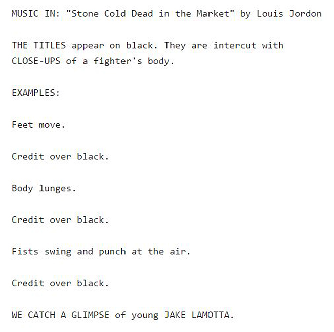
The opening title sequence as described in the Raging Bull screenplay
At that point where we made a cut back to the black-and-white print – that was the rest of the film – I discovered something. Back then they did what is called a positive edit. They spliced every print together. So they had the title section on coloured stock with the soundtrack and then it was physically spliced by a film negative person at the lab onto the first frame of the rest of reel one and then the rest of the film is in black and white. But the black-and-white print was thinner than the colour print, so at the point that the colour print ended and the black-and-white began sometimes there would be a loss of focus because it would go through the gate of the projector. It would bounce because it would go from the thicker to the thinner stock, so we had to put a special sign at the head of the reel, before the leader, that advised the projectionist to ride the gate. If he knew where the title was going to end and the black-and-white would start, he would be right there to refocus if necessary. It was handled in a very unique way through the process. I oversaw the whole thing for all 50 prints and everything else that had to be done to make sure that it was right.
You worked a lot with Scorsese after that, didn’t you?
Dan: Yeah, I did 10 films with him. But the last several have not been with him. He’s either not filmed one or chose someone else. He’s been working with a guy in New York who does some nice work at Big Film Design, Randy Balsmeyer. He’s a good designer.
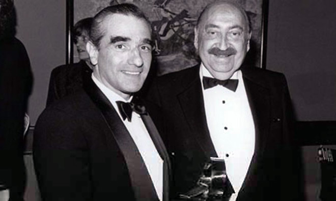
Martin Scorsese and Saul Bass, c. 1990
Dan: After I did seven or eight films with Scorsese, it just became too difficult to work with him – he was in New York and I was here in LA – and so he hired Saul Bass. Saul did four or five films with him and then when Saul died I went back to Marty and did two others. When Saul was doing Marty’s films he would always call me over for lunch, because he knew I knew him so well. We’d talk about Marty, especially about how to bill him. “What kind of money could I get?” Saul could get four or five times what I could get! It was amusing that he was insecure about that and relied upon me as someone who’d dealt with Marty.
The Fan (1981)
The Fan (1981) main titles, designed and directed by Dan Perri
So let’s talk about a film you worked on that people might not be familiar with: The Fan. You designed and directed that entire opening sequence, right?
Dan: That was a sequence that I directed. There was another film called The Fan with Wesley Snipes and Robert De Niro done some time in the ‘90s, but this was an earlier film by the same name. I’d used this special camera before called a snorkel camera – sometimes it’s called a periscope camera – and it allows you to move in between objects on a tabletop or a desk. It creates a very dramatic, bigger than life, horrific kind of feel when you shoot everyday objects with it. You could get right down in between a stapler and a glass of water. I’d used it on a picture called Tough Guys with Kirk Douglas and Burt Lancaster, and then The Fan came along. It was about this guy who was this obsessed fan of this actress. He kept writing letters to her and trying to meet her. It comes from this book of letters and they dramatized it. Lauren Bacall, James Garner, and some big names were in it, but it came out just as John Lennon was killed, so the idea of a fan pursuing a famous person wasn’t something that people wanted to see. So it died a sudden death, but it was a good movie.
What was your concept for the opening of the movie?
Dan: I had been asked to create a sequence for it, so I offered to film the desk and location where this guy was writing these letters. So we saw all the objects that defined his character and we moved between them creating this kind of scary world.
Michael Biehn came back for the day. He was difficult, but that was his job. We subjected him to all this torture. The camera is hung from an arm or kind of a crane and it shoots down. Then there’s a tube that extends the lens about 18 inches or so and on the end of that tube is a little arm that holds a square mirror that tilts. The camera sees straight down into this mirror and depending on the angle of the tilt it sees out or slightly low or slightly up. It could duplicate how your head moves and it could rotate 360 degrees. So with a combination of being able to move between objects or look back at this glass or down at the table it’s on, you can do some really terrific things. So I brought that to life.
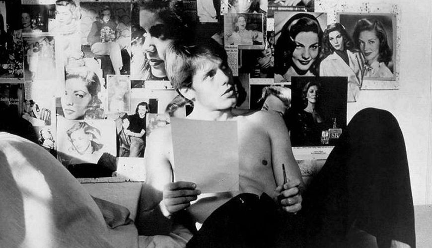
Michael Biehn in The Fan
Dan: The shots of Michael Biehn where we’d pan across and come to his nose and eyes, we were so close to him that many times we’d bump into his nose and it’d bump the mirror off the holder. Of course then the take would be ruined and he’d be upset. We had so many lights on him that we had to mop him down because he was sweating so much. You had to pump more light than normal up that tube that extends the lens, more light than normal, because it diminishes the intensity of the light. It must have been 120 degrees in that room we had so many lights on him.
Pino Donaggio did this wonderful, wonderful music for it which I was able to cut to, so it enhanced it even further. It won an award at the New York advertising show that year as well. So it was nice. I really had a good time doing it. I shot it, I directed it, and edited it as well, I finished it with optical effects and delivered it.
The Equalizer (1985)
The Equalizer (1985) main titles, designed and directed by Dan Perri
It seems like you were still working primarily in film in the 1980s, but in 1985 you created the opening for the popular television series The Equalizer. What was the original concept for that sequence?
Dan: The show is about this guy who’s an ex-cop who is hired out to help people and protect them. He’s “equalizing” the relationship between victims and these vicious people trying to take advantage of them in some way. So I pitched the notion of this world of jeopardy for the sequence. We saw half a dozen or so different people in different jeopardy situations and then The Equalizer shows up and solves their problems.
We shot it all over New York. It was cold! My cameraman was an independant DP who was really good at rigging stuff. So we found ways to mount cameras on different things. We didn’t have a lot of equipment – couldn’t afford it – but there’s a shot where we’re tracking behind this woman who’s running away from someone, and he created a little bag out of a piece of netting and just held it and walked along behind her. The camera was swinging a little bit inside that bag, but we just did whatever we had to do to create the shots that we were envisioning. We had a really good time! It was a small crew who worked really hard through the night for two or three different nights and got a lot of good stuff.
You also worked with the show’s star, Edward Woodward. What was he like to work with?
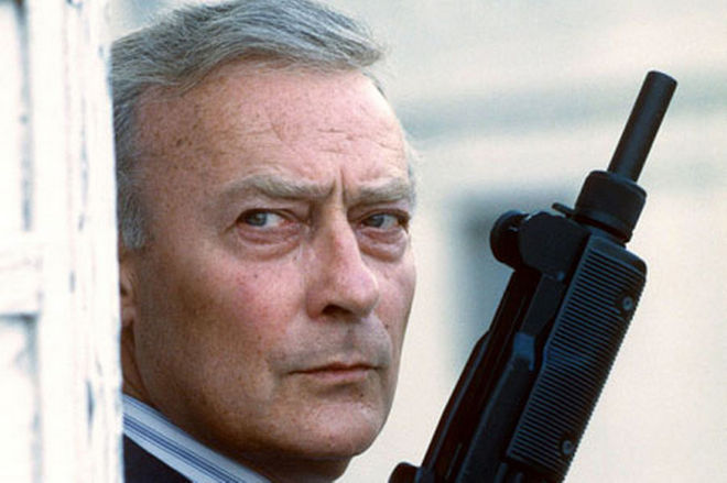
The Equalizer star Edward Woodward
Dan: I had a half an hour to shoot Edward Woodward. The production offices were up on 11th Avenue in a big building and we shot it in the parking lot where everyone parked their cars. We moved some cars and made space for the Jaguar that was his car in the show. He came out from the offices where he was resting a bit before they had to go shoot the episode that afternoon. I grabbed him and said, “Just stand here and give me a tough look.” We had a dolly that I moved toward him and did half a dozen takes of him standing there playing tough guy. Then he went off to shoot the episode. He was very nice. He was a professional and that makes a difference.
And what about the logotype? It was very memorable.
Dan: One of the things that was popular at the time in terms of title treatments was a glow. The type would have a glow on it. It further has a dimensional slant to it, the letters are very tight and hugging each other. I designed it so it would have a uniqueness but still a simplicity, so it could be read quickly and make a no nonsense statement, just the way the character was. It slides in and then on cue with the big downbeat in the theme it glows. That kind of stings it and gives it this permanence, it brands it, makes it solid and stationary. It ended up being a big hit. It was a really nice experience and a good product came out of it.
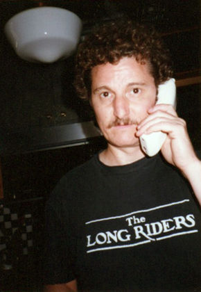
Dan Perri in the mid-1980s wearing a t-shirt featuring his logo design for The Long Riders (1980)
To say that you were working quite a lot during this time would probably be an understatement. How many projects would you say you had on the go at once at the height of this period?
Dan: At one point I remember I had this little bulletin board I put up with the grease pencil; you know wind it all up and look at all the films that I was working on and I had to tape a piece of tape to the bottom of it and add four more. I had twelve films at one time.
That period of time that was most concentrated but on average I would do ten or twelve films a year. I was very fortunate that I was always working and rarely did I even have to make any phone calls to look for work. They say you're only as good as your last picture, and my last picture was always the good one! I didn't always do something spectacular or unique but I was memorable just by being associated with a successful film. Everybody wanted you to be on their film because it's like good luck or some superstition.
The Player (1992)
The Player (1992) main titles, designed by Dan Perri
So in 1992 you reteamed with Robert Altman for The Player. Had you kept in touch with him in the intervening years?
Dan: After Streamers, a military film we did in 1983, we’d always talked about working together again. I think The Player might have been the last film we did, but there was about a nine year gap there. Bob used to always get mad at people. They’d fall out of favour with him and then he wouldn’t use them for a while. I still don’t remember why, but he got mad at me at some point so I was sort of on the outs.
I was never comfortable with calling and saying “Hey, can I do this film?” because I was afraid I’d get his wrath, you know? Then finally after a number of years, when he was doing The Player in LA, I went over to visit him and it was like nothing had ever happened. “Dan! How you doing?” So I fell back into his favour. He invited me to the set and I watched a lot of the film being shot. For the title sequence he decided he wanted to do what Orson Welles had done, this long uninterrupted shot like Touch of Evil.
Touch of Evil (1958) main titles (restored version), directed by Orson Welles
Dan: He had to choreograph the whole thing; there’s a lot of dialogue going on and the camera is going everywhere and all over the place. He wanted me to help with the speed and rhythm. I really didn’t do much. The titles were put on later of course, but I was able to advise him a bit about where a title could play without interrupting dialogue or going over someone’s face. There’s got to be spaces where the frame is relatively calm where a title could play. Then within the frame the action going on had to be above a certain point so you could lay the titles below it and not obstruct anything. Every move had to ride high over whatever the action was and leave air below it where the titles could live. There was a lot of titles to accommodate as well. It was all over one shot, so it had to be placed just right and the timing had to be compressed so they would all fit in. You didn’t want them to get in the way of each other or of the action going on. So it was a problem in that way. When it came time to apply the titles, we wanted something that was unique. So I played around with all kinds of different motions and that was the one that was most complimentary.
Insomnia (2002)
Insomnia (2002) main titles, designed by Dan Perri
Let's jump ahead a little bit. Like many other areas of film production, title sequence production started to become more and more digital in the late ‘90s. What was that period of transition like for you?
Dan: Well, at first, most of us were afraid of digital. You didn’t know how it worked, but there was all this talk that it could do so much more than you could do optically. It was so accurate – no dirt and no imperfections. But the early equipment was fairly limited and would often break down. It wasn’t reliable, so people were reticent to get involved with it. But those who did work with it started to produce really good work, really unique stuff that could be done just by twisting knobs and pushing buttons. The software was such that it could do things that film just couldn’t do, or could do them so much cleaner or faster or cheaper.
So eventually the effects company that I worked with regularly bought some equipment and hired a couple of guys to run it, and I finally got a chance to work with it on a job. Then I found that it was just another tool that you could use effectively if you knew what it could do. So I started designing things that I could do digitally. By the time Chris Nolan came along with Insomnia I was doing digital work in parallel to optical work. There were many films that couldn’t afford digital effects or didn’t need them. So I was working in both worlds.
How did you get involved in Insomnia?
Dan: Chris came to me. He wanted me to do his first big Hollywood film. He said to me, “You’re the optical master. I want you and no one else to do the titles for my movie.” They weren’t shooting film digitally very much, but doing effects digitally was more and more common. Chris wanted me to do it optically though. I said I could probably do it better digitally, but he said, “I don’t want my films have anything to do with the digital world. I’m shooting on film. I’m doing all optical effects. Even if there’s something that digital could improve upon, we’ll either do without it or we’ll do it optically.” He wanted my optical work, my optical experience, my optical eye, and the optical knowledge to be brought to his film. So with that edict it was like “You’re on, man!”
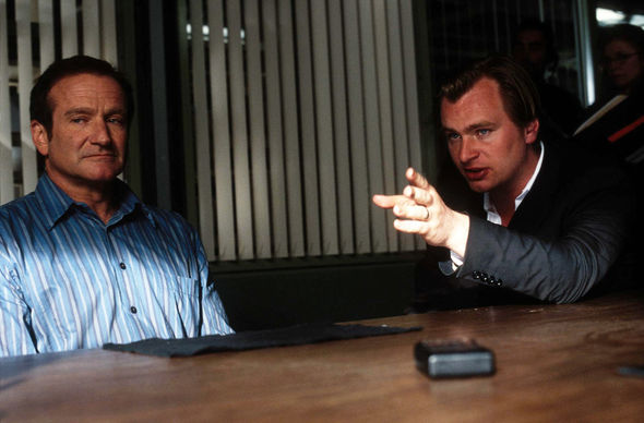
Robin Williams and director Christopher Nolan on set of Insomnia, 2001
What was your concept for the title sequence and how did you develop it?
Dan: I had a concept where everything that had to do with rack focus because it was a mystery. This film is about discovering evidence and things becoming something different than what you thought. So everything was changing and racking focus from sharp to blur or back again. That was what the titles were about. The Al Pacino title would come in like and then it would fade out against white, this kind of dirty white, and it would fade out and leave a couple of letters, then Hilary Swank or whoever would come in next. The letters that were common to the previous title would now fit into the new title. So it’s gradually adding letters on and then finally they pull apart and it says “Insomnia”. Chris loved the idea, but I had to do some testing first.
So I started developing things with my editor on my Mac. But on a computer back then, you couldn’t do a rack focus but you could do a blur. So you can go from sharp to blurry and all ranges of blurring, but you can’t do an actual lens rack. There is no lens on the computer! But I had to create something that looked like a lens rack with blurring. So I designed and developed it and it became more and more sophisticated. Finally, I showed Chris a version of it and he liked it a lot.
Then went to my optical effects company and I said, “OK, we’re doing something optically now,” which they weren’t used to doing anymore. They had the cameramen and the cameras, but they had to do it individually. We starting doing tests and so I started doing real rack focuses with lens on letters and titles. It looked very different. A real rack focus didn’t look like the blurs that I was showing Chris. I shot all these tests and I didn’t like what I was seeing. I finally took it to Chris and he didn’t like either. I tried to tell him I’m going to have to produce this digitally to get the effect that we both like so much. He wouldn’t hear of it! He even walked out of the room when I was trying to tell him. So wisely, his editor, an old friend of mine named Dody Dorn, she said, “You’ve got to write it to him. Just write it down and explain if you can and he’ll sit quietly read it and he’ll OK it.”
So I did that. Chris read this letter and said, “OK, I’m not crazy about this idea because I wanted to do everything optically, but I want what you’ve done. So if the only way to give it to me like that is to do it digitally, then do it.” It was ironic. He wanted me in the first place so I could do something optically and we wound up doing it digitally. It looked great and he was happy, but he had to give up his optical obsession.
The Last Waltz
You and Martin Scorsese got back together in the early 2000s. What was it like working with him again after all those years?
Dan: After doing seven movies with him – 20 years had passed – I was hired to do Gangs of New York. I arrived in New York, went right to the screening room from the airport, and we both said together, "You look exactly the same!" We hugged and it was like no time had passed at all.
Gangs of New York (2002) main-on-end titles, designed by Dan Perri
What’s the story behind those big wood letters? Did you make those?
Dan: Those are old wooden block letters from actual typesettings from the 1860s. I still have all the letters that came from the box. I photographed that with a five megapixel camera, just put it on my picnic table out my back yard, took a shot, and built the sequence.
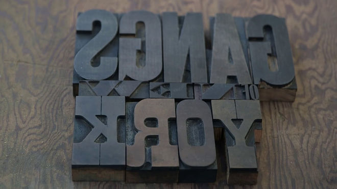
Wood typesettings used in the Gangs of New York title sequence
Scorsese jumped right into The Aviator after Gangs. Were you already on board when that film started production?
Dan: I knew early on that he was doing The Aviator, so I said, “Marty, why don't we do a couple of trade ads to announce it?” I'd design a logo and we'll set a look,a style, a feel, and an atmosphere that you want for the movie. Then when it gets to the advertising, it will be exposed to the industry, it’ll have some mileage on it, and they'll wind up using it. It’ll looked like the movie you want it to look like. He loved the idea of that.
The Aviator (2004) main title, designed by Dan Perri
Dan: So I designed this one trade ad and I created a whole bunch of alternate logos. We settled on the one that was going to be sculpted. He wanted to do it, but I was pushing. When it came time to see it, it was “Oh, I can't do it today, I'm busy shooting.” This was in the middle of production. I'm very persistent, I just kept pushing him. I got his producer on my side and he would push, and finally we got it done.
What were some of your early conversations about the title sequence?
Dan: I was gonna do a sculptural sequence – the logo is a sculpture. It was gonna be a whole sequence of shots from the film that I was gonna make into these big bas-relief sculptures, literally big six foot sculptures and we were gonna film it; shoot it and film across it and so on. It was gonna be metal with both gold and silver and so beautiful. I culled tonnes of pictures, spent days on end over at the production office and going through all the production stills and pictures from the movie. Then I did a lot of effects in the computer to illustrate how a bas-relief might look. I did tonnes of tests of that.
The Aviator (2004) bas-relief concept test designed by Dan Perri
Dan: Then they pull the plug on it and suddenly my budget was pulled down.
So that’s why it ended up just being the sculpted title card...
Dan: Then when it came to the advertising, Warner Bros. had their own ideas, as usual, and they gave me an airing. They looked at some of my ideas, they looked the logo for the screen, and they did adapt the metallic qualities, but it ended up being a senseless kind of type style that had no relationship to the movie. So it didn't really accomplish what I'd hoped it would. Maybe he had fights with them protecting me? I don’t know. On the next film he hired somebody else, never telling me that they’re not really going to use the designs. That really hurt. Since then, I've never attempted to reach him.
You haven’t spoken to him since then?
Dan: After The Aviator we grew estranged. I still don't know why. He wound up hiring Nina Saxon to do The Departed. The way it used to work – after I knew what he was doing and knew that he was in post – was I’d start calling the editing room and talk to Thelma [Schoonmaker]. “We’re not ready yet. Maybe another few weeks call again.” I’d call back and it was “Well, we’re not going to do anything.” Maybe they were going to get the VFX guy to do it, pick a type style and that was that. I should have sent some layouts, you know? “Use any one of these you want!” Months later I ended up seeing it and it was just a little title card. Nina Saxon had credit for it. Never heard from him again. I guess my pride prevented me from calling him and saying, “What happened? What did I do?”
The Beaver (2011)
The Beaver (2011) main titles, designed by Dan Perri
Let’s talk about some of your more recent work. You created a really nice opening for Jodie Foster’s film The Beaver.
Dan: Jodie initially hired me to do simple titles over backgrounds, but one day in a meeting she said, “This guy is psychologically drowning.” In the movie he’s like catatonically depressed and all he does is lounges around in his pool. The first shot is him drifting across the frame. So I said, “Wow! What if we put the titles in the pool like they’re drowning?” She loved the idea, so I went to an architectural letter place that built signs for doctor’s offices and that sort of thing, and I bought a bunch of letters. I put them on the first step of my pool and I shot some video, rippled the water a bit to give it some distortion. I showed it to her and she really loved it. “Yeah! Go do it.” The producer was there that day and heard her say that, so everything changed from that point on. So I just went ahead and did the work.
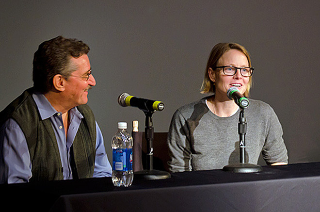
Dan Perri and director Jodie Foster at the ArtCenter College of Design in 2011.
Dan: One of my students at the time had a first generation RED camera that shot 4K. So we shot the sequence over one afternoon at my house and I then cut it together. I used that same effect that I used in Insomnia where there are letters that were common from one title to another. There were a series of introductory presentation titles, so and so production presents and whatever. I did all that underwater, so I had to find a way to register the letters so that they lined up from title to title. I put it underwater and shot each title, composited it, lined it up, and put it together digitally. I went back to my roots with the ACME peg system, which is used in animation mostly, but when you’re lining up letters to be shot on film you can use this peg system. I had to devise a method of doing that underwater. It was only once I put it together on the computer with Final Cut Pro did I find out whether it worked or not. If it didn’t work I would have had to go back and shoot it all over again. It worked out well. And Jodie was happy with it, that was the best thing about it.
Title Designer, Filmmaker, Author
Sharkskin (2015) trailer
So in addition to all of this incredible title design work, you also recently completed your first feature film, Sharkskin, and now you’re publishing a book about your career – which you’re about to launch on Kickstarter. What have these two projects meant to you as a creator?
Dan: They’ve meant a lot, given the length of time it took me to do the film – over 24 years – and then the book, which has been gestating for at least 12 years. I don’t know what that means or what that says about me, hopefully good things, but I could also be perceived as some crazy person who just won’t quit. [laughs]
What can you tell us about the book?
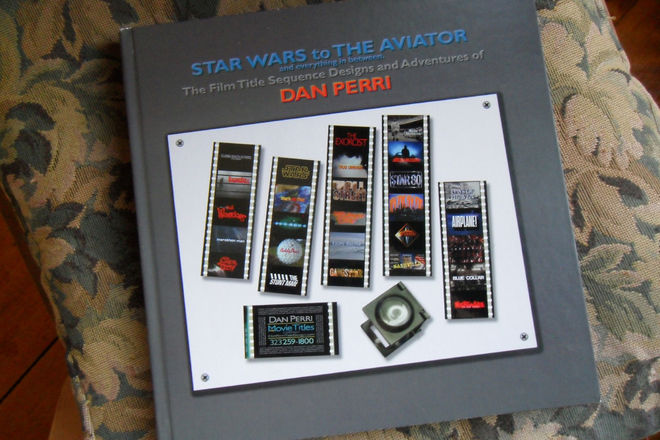
Dan: It will be about 200 pages and cover about 30 films. Every four pages covers one movie. The right page would be a logo of the film, a little film strip, and then you turn the page and those two pages are storyboards across both pages and then there's copy on both side of it where I talk about the film, the design, and share stories and anecdotes about working with the different filmmakers. In some cases, if there are other designs or collateral pieces I did, that'd be on the back side of the fourth page. Like when we did The Exorcist and Close Encounters, I did the ad campaign, the book design, and the record album cover, and the t-shirt and so on. It’ll show whatever else I might've done on the film on subsequent pages. There will also be unused designs. For example, when I started going through my archives looking for artwork that I still had, I came across four rejected logo designs for Star Wars. Those will be in there.
That sounds amazing – and like a lot of work!
Dan: Those two projects were going simultaneously and I wanted to do both so badly. I never gave up. But that’s really what it took. To never let go of it. One has come to fruition and now the other one is about to, so I’m really proud of that. We’re ready for it and I hope it all goes to plan.
