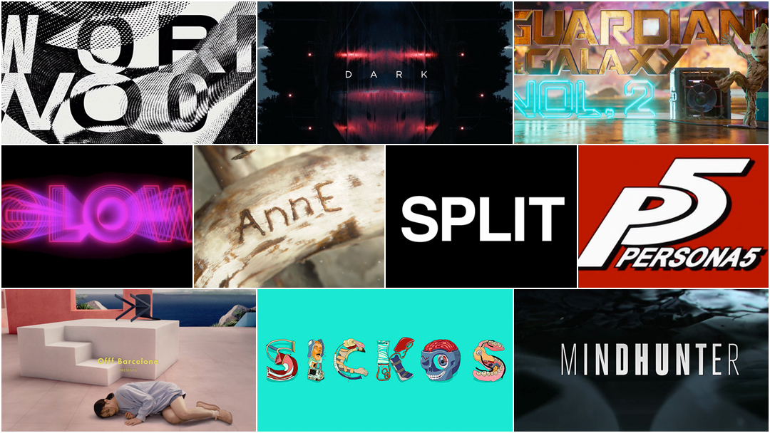


The Very Best Title Sequences of 2017, as chosen by Art of the Title
For our fourth annual list of the year’s top 10 title sequences, Art of the Title’s editors chose from among film, television, video games, web series, and conferences. The Top 10 of 2017 were chosen based on criteria such as originality and innovation, impact, atmosphere, relevance to subject matter, and technique.
Paring the long list down from 142 to just 10 was a difficult task, but one done with relish. These title sequences were painstakingly crafted, acted, shot, composited, modelled, painted, choreographed, rotoscoped, animated, typeset, and hand-drawn by teams large and small all around the world, with budgets modest and mighty, in state-of-the-art facilities and in home studios. So sit back, relax, and enjoy some of the most interesting and innovative work to hit screens this year. These sequences represent the cream of the crop.
Art of the Title's Top 10 Title Sequences of 2017
10. Sickos
CATEGORY: WEB
Created by Mill+

In 26 short seconds of bright colours and lumpy drawings Creative Director Anzie Lee and the team at Mill+ introduce viewers to Sickos, a web series created by and starring Laura McKenzie, Laura Grey, and Mary Winn Heider. Set in a world of medical school training and simulations, the series focuses on an all-sorts mix of actors and artists who make a living pretending to be ill. The opening sequence is a surreal traipse through ailments and attitude, one great dollop melding into the next and punctuated by sniffs, knocks, and kisses.
The title when it arrives is the pièce de résistance: flesh and faces, crutches and IVs, mandibles and machinery, all delightfully bent into the forms of letters. The peppy colours, irregular animation style, and oddball humour culminate in an opening that takes the piss out of title design and stands out on its own.
9. OFFF Barcelona 2017
CATEGORY: CONFERENCE
Created by Vallée Duhamel
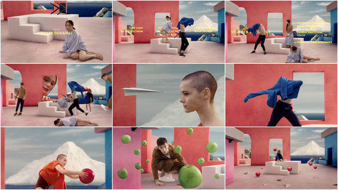
The main titles developed by studio Vallée Duhamel for creative festival OFFF Barcelona 2017 are an elegant piece that gets more complex with every spritely step.
Directed by Eve Duhamel and Julien Vallée and featuring interlacing choreography by Isabelle Boulanger, the sequence presents a jumble of youthful characters and their light accoutrements: a sweater, a paper airplane, a book, a ball. In this lofty and pensive piece, simple shapes and vibrant colours take centerstage, moving and being moved with a sleepy grace. The overlapping technique comes from the experimental and Oscar-winning 1982 short Tango by Zbigniew Rybszynski, a mesmerizing film in which a single room gets progressively more crowded as characters and their paths are superimposed. For OFFF Barcelona, Vallée Duhamel take a highly polished approach to this idea, calling upon costume sponsors including COS and Laugh by Lafaille, among others, the influence of fashion and commercial advertising present in every frame. The music, “Pressure” by Milk & Bone, lends everything a sweetness and innocence, a sprig of play and discovery. Like the opening to Wes Anderson’s Moonrise Kingdom, a plethora of meticulously groomed characters inhabit a tightly curated space while drifting in a world of their own.
8. Persona 5
CATEGORY: GAME
Created by Atlus
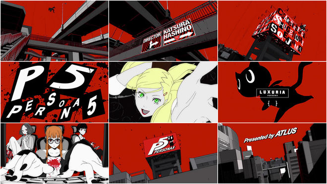
A flashy, eye-catching intro cinematic has long been a staple of role-playing video games, particularly at the birth of the 3D era when graphics technology couldn’t quite match the scope and scale of the stories being told. Games like Fallout and Final Fantasy VII were anchored by, what were at the time, breathtaking pre-rendered intro cinematics. But now that such openings are commonplace in every genre of video game and real-time graphics can finally compete with what once took hours or days to render, how are designers expected to kick off their games in a way that will impress players? With style, of course.
Persona 5’s distinctive, minimalist art style sets it apart in a genre that is now practically defined by convention. The most recent entry in the Persona series, the game follows a familiar formula: a group of teens battle supernatural forces against the backdrop of high school life. In Persona 5, the high schoolers in question double as the Phantom Thieves – a gang of psychic burglars who fight evil inside the minds of corrupted adults. It’s a wacky premise, but it’s all grounded by a coherent style which carries through to every aspect of the game, from the character designs to the user interface. Key to Persona’s art style, which is first established in the game’s intro cinematic, is the bold black and red colour scheme that’s not only a nod to the series’ manga influences but lends a sense of drama and kineticism to the proceedings that most RPGs simply cannot rival.
7. Wormwood
CATEGORY: TV
Created by Errol Morris with Igor Martinovic, Steven Hathaway, Jeremy Landman, Victor Hu, Ring of Fire
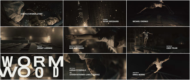
The opening moments of the Netflix series Wormwood throw viewers into the figurative deep end – complete with surreal, dreamlike imagery and cryptic bible verses – before literally throwing the docudrama’s central character out of a 13th floor hotel room window. The fatal plunge of Frank Olson (Peter Sarsgaard) on a cold November night in 1953 has baffled his family and others for more than half a century, and it’s his mysterious death that anchors director Errol Morris’s ambitious new miniseries.
For Wormwood’s main title sequence, Olson’s entire fall plays out in slow motion. The frame rate varies as the man twists and tumbles through the air in a shower of glass, all while Perry Como croons the romantic show tune “No Other Love”. There are shades of Don Draper's fictional fall from grace from the opening of Mad Men, but Wormwood's titles are true crime not dramatic conceit. As Olson plummets toward New York’s 7th Avenue, the combination of music, lyrics, and visuals strikes a regretful and dissonant note. His descent nearly at an end, the warping, hallucinatory title card envelops Olson, the pavement rushing up to meet him.
Who was Olson? Who did he leave behind? Did he fall or jump – or was he pushed? Wormwood’s title sequence sets the stage for all of these mysteries to be explored and unravelled.
6. Guardians of the Galaxy Vol. 2
CATEGORY: FILM
Created by Sarofsky Corp., Framestore
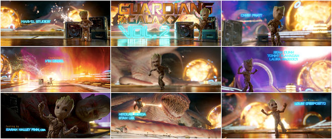
The joy is in the details. And there is no shortage of detail in the bombastic, toe-tapping opening to Guardians of the Galaxy Vol. 2. The two-time galaxy savers – Star-Lord, Gamora, Drax, Rocket, and, of course, Baby Groot – are at it again, this time battling the Abilisk, a giant interdimensional beast.
Baby Groot, mischievous and distracted and utterly in his own world, dances to music from Star-Lord’s second mixtape while the Guardians throw down in the background, out of focus. The focus on Groot instead of the main action is the first comedic thrust of the film, a hilarious stroke of wit that dumps audiences in medias res but with the major action just beyond reach. The custom typography developed by Sarofsky for the first Guardians of the Galaxy film returns here, providing familiarity and brand consistency. As the camera buzzes between laser blasts and flailing tentacles the film’s credits appear wherever there’s room. Meanwhile Groot continues his dance, adorable and oblivious to the events around him, losing himself to the the bright and irresistible “Mr. Blue Sky” and giving the Marvel film a jump-start.
5. Split
CATEGORY: FILM
Created by Filmograph
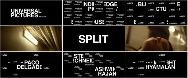
The opening to M. Night Shyamalan’s Split is a sinister and sophisticated introduction to a twisted character, a glimpse into a fractured mind, all sharp angles and darkness.
With nods to the iconic and minimal main titles to Alien, designed by R/Greenberg Associates, and Psycho, designed by Saul Bass, the sequence builds upon a rich title design tradition. Title sequences that focus exclusively on typography are rare, particularly in the current context of CGI-heavy work. Designed by Creative Director Aaron Becker and LA-based studio Filmograph, the opening sees each on-screen credit sliced up, segmented into a 24-frame grid and layered, like some kind of grim sister to the titles of The Seven Year Itch. The combination of black screens and Helvetica in white has not been used this effectively since Dan Perri’s work for All The President’s Men in 1976. Paired with the percussive and moaning score from West Dylan Thordson, the effect is eerie and unnerving, alluding to heavy creatures moving in dark corners — a nightmare on the edge of reality.
4. GLOW
CATEGORY: TV
Created by Shynola
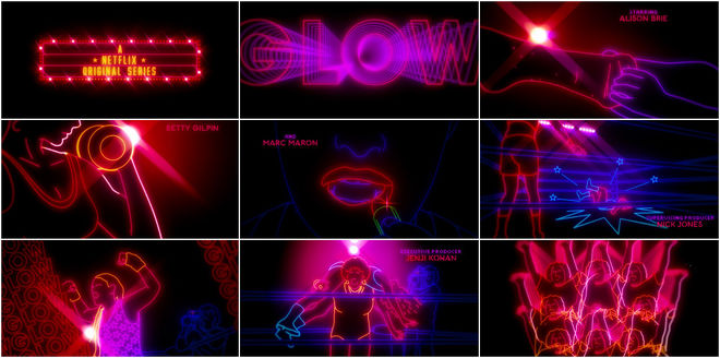
A cavalcade of neon-outlined combatants warm up before facing off inside the squared circle, mixing free weights and stretches with liberal amounts of hairspray and lipstick. The bell rings and these luminous warriors take each other to the mat, leg dropping, suplexing, and performing all manner of highflying top rope takedowns for the crowd.
This is G.L.O.W — the Gorgeous Ladies of Wrestling — combining visceral thrills and athletic feats with the glitz and glamour (and exploitation) of Hollywood. To execute the opening, producers turned to UK outfit Shynola. Rotoscoped footage of actual wrestlers gives the neon figures vibrancy and realism while graphic trails and geometric flourishes evoke motion design trends specific to the time period. Paired with Patty Smyth’s triumphant rock ballad “The Warrior”, the result is a gleeful throwback to a bygone era of wrestling and a celebration of the colourful personalities that made 1980s sports entertainment so much fun.
3. Mindhunter
CATEGORY: TV
Created by David Fincher, Blur Studio, Neil Kellerhouse
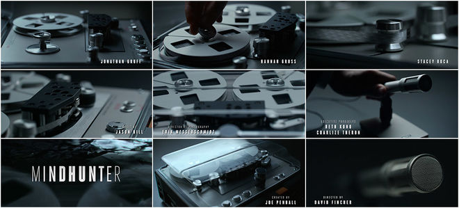
"Nobody knows that they saw it, but they did." The particulars of who saw what and when are always key in Netflix’s new serial killer drama Mindhunter. But the real mystery for the FBI’s fledgling Behavioral Science Unit lies in deciphering which of those details is the most important and why. Engaging with Mindhunter’s titles (the show was one of the first to feature Netflix’s “Skip Intro” button), means becoming well acquainted with the most vile, stomach-churning specifics of the crimes being investigated. As an unseen FBI agent carefully prepares a portable audio recorder for an interview, crime scene photos almost subliminally flash on screen for a frame or two. The winding of the tape cuts to a victim bound with rope, the spool and spindle of the recorder becoming a decaying, maggot-riddled face, and so on. What is it to have such images flashed into your brain in the blink of an eye? Mindhunter takes many of its cues from the work of executive producer David Fincher, who also directs four episodes of the first season. In the director’s 1999 film Fight Club, one of the main characters – working as a projectionist – spends his spare time splicing single frames of porn movies into the reels of family-friendly films for kicks. Here the kicks are Fincher’s as he blasts images of human horror at the unsuspecting viewer.
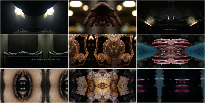
2. Dark
CATEGORY: TV
Created by ARRI Media VFX, Lutz Lemke
Tyger Tyger, burning bright, in the forests of the night;
What immortal hand or eye, could frame thy fearful symmetry?
English poet William Blake asked this question in 1794 and today we ask it still. In Dark, Netflix’s first original German-language series, co-creators Baran bo Odar and Jantje Friese present an intricate mystery filled with curious characters, fractured memories, horrifying legacies, and more than a dash of the supernatural. The thriller aptly opens with a stunning sequence that takes our world and dismembers it, assembling the pieces into something eerie but beautiful. There’s a discomfort in the imagery, an awkward folding of bodies and forms. Doorways bend into themselves. Eyes blink impossibly inwards. With design by ARRI Media VFX and Lutz Lemke and music from Apparat featuring Soap & Skin, the title sequence is a disquieting scrapbook of moments and deeds. The work of title designer Danny Yount immediately comes to mind, particularly the opening to 2001’s Six Feet Under, as well as Yount’s symmetrical titles for Semi-Permanent Portland 2013.
In the forests of the night, in a small German town, the fearful symmetry of history keeps coming. It’s all there, in the title sequence – a fascinating kaleidoscope of life and intimacy and death and time.
1. Anne (Anne with an E)
CATEGORY: TV
Created by Imaginary Forces
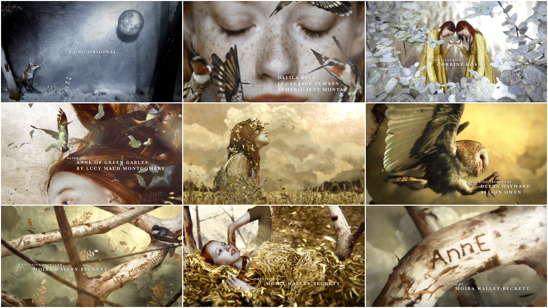
The opening to Anne, the newest adaptation of the classic book by L. M. Montgomery, is a gorgeous and gilded journey through the seasons. The show takes Anne of Green Gables into new territory, bringing a dark sensibility and a sharp eye to the story of an orphaned young woman on Prince Edward Island in 1890.
The series’ opening sequence, crafted by Creative Director Alan Williams and studio Imaginary Forces along with Artist Brad Kunkle, tells the story of Anne through her movement in nature. It begins with a cold, wintry landscape and images of a girl, fragmented and lonely. This soon gives way to warm hues and hummingbirds, yellow dresses and shimmering leaves. It’s a lush, glimmering world of silver and gold specks, freckles and fauna and flowing copper hair, all dappled with light. The end of the sequence – to borrow the words of Tragically Hip frontman Gord Downie – is “cast in a golden light”. Newcomer Amybeth McNulty, delicately painted by Kunkle, is Anne, lying in the woods, serene, her world beginning to take root. That’s Anne spelled with an E, if you don’t mind.
—
...and that's a wrap!
There are so many amazing title sequences we weren’t able to include in this top 10, but many of the year’s most notable sequences are available in our 2017 titles list. We recommend checking out our in-depth article on the gorgeous end credits to Wonder Woman, the Blade Runner-inspired titles for Pause 2017, and the parody-packed openings to Nirvanna the Band the Show.
Love our choices? Disagree with our picks? Did your favourite title sequence not make the cut? What were your favourites? Tweet us at @ArtoftheTitle and have your say.
Thanks for joining us for another incredible year in title design. Here’s to an exciting 2018!
—Art of the Title