09/22/2013 UPDATE: Congrats to Huge Designs on their Da Vinci’s Demons Emmy win.
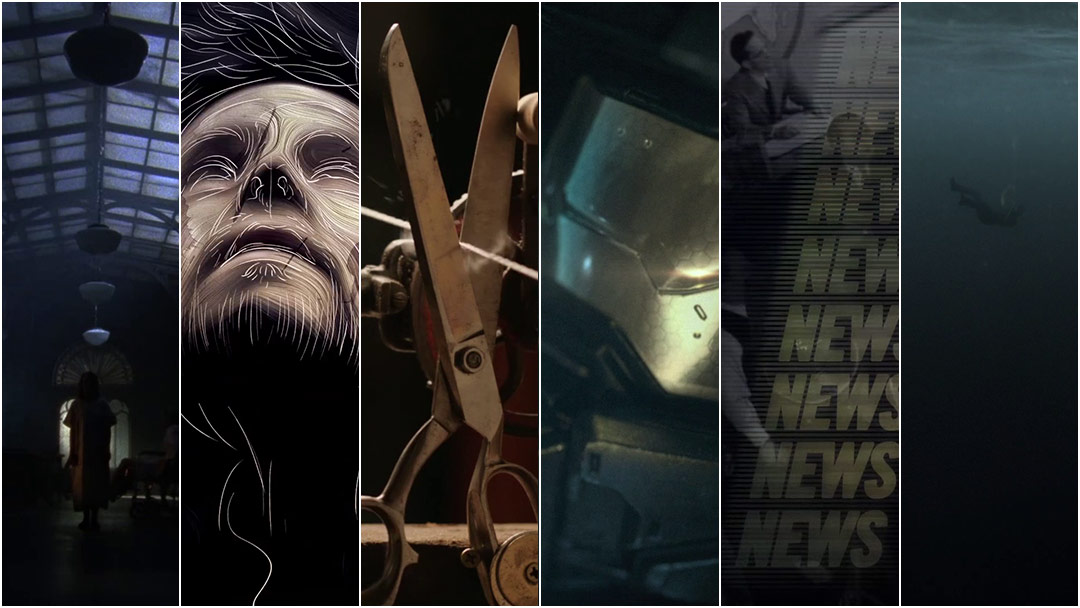
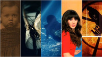
The 2013 Emmy nominations for Outstanding Main Title Design have just been announced and once again they feature a wide variety of work from studios both large and small.
As is always the case with awards of this ilk, there are nominations which immediately resonate. Of course, there are also nominations which are sure to baffle audiences, the ones seemingly chosen simply because they exist. Below, we outline the nominations we stand behind, and those that baffled us outright.
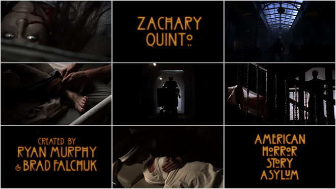
AMERICAN HORROR STORY: ASYLUM
FX Networks
Taking a step back from season one’s skin-crawling house of horrors title sequence, Kyle Cooper and company instead concentrate on the patients and doctors of the Briarcliff Mental Institution, the setting for season two of this anthology series. While not as scary or innovative as the earlier version, the sequence’s focus on the new location certainly drives the point home. However, it doesn’t do much else, instead rehashing established horror tropes: one part gloom and decay, one part industrial score, a dash of disjointed limbs and contorted faces, a smidgen of gore, and a pinch of burning celluloid. It’s been nearly two decades since Se7en, though, so one would think Cooper would grow tired of producing dark, depraved, and roughly-textured title sequences.
DA VINCI'S DEMONS
Starz
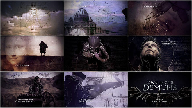
In the opening to Da Vinci’s Demons, Huge Designs illuminates new facets of Leonardo da Vinci’s feverishly inventive and enigmatic mind, and brings them to life in a way that only modern-day machinations could. The sequence reveals reams of hand-sketched notes, masterworks from da Vinci’s own hand, subtly suggesting that there’s more to the prolific artist and polymath than even he may have known. Bear McCreary’s driving and palindromic score is a delightful example of how to take inspiration from the source material and produce something innovative, appropriate, and truly mesmerizing. Ultimately, this sequence combines grace and intrigue, bringing together beautiful visuals and a spellbinding score to effect a triumph of motion design.
Read our in-depth discussion with Creative Director Paul McDonnell of Huge Designs.
*With notes from Angel Tagudin
ELEMENTARY
CBS
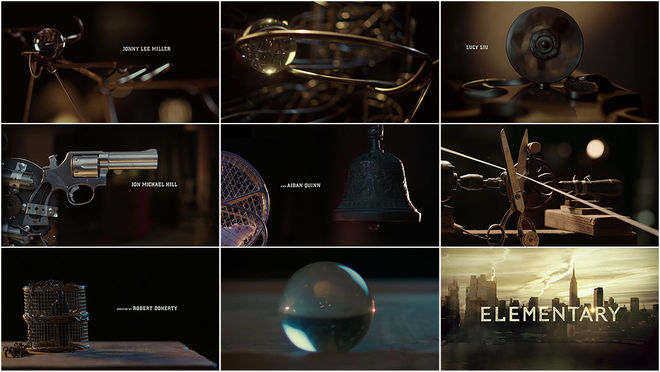
Reflecting CBS’s contemporary take on a classic character, Prologue’s opening title sequence for Sherlock Holmes series Elementary employs an impressive Rube Goldberg contraption to represent the manic detective’s unorthodox approach to solving crime. No doubt a nod to Stephen Frankfurt’s unparalleled To Kill a Mockingbird opening, the sequence follows a large marble on its journey through the elaborate apparatus. The sequence is held together by clever editing and whimsical production design, beguiling the viewer into assembling the machine for themselves. The effect is sheer sleight of hand, a fascinating distraction from the fact that in the end, the whole is not greater than the sum of its parts. Roped along, hoping to crack the case, the true mystery is why we bother at all.
Read our in-depth discussion with Creative Director Simon Clowes of Prologue.
*With notes from Noah R. Taylor
HALO 4: FORWARD UNTO DAWN
Machinima.com
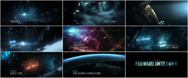
Picking up where video game Halo 4 left off, Polynoid’s gorgeously rendered intro for the live-action web series Halo 4: Forward Unto Dawn chronicles four very lonely years of cryo-sleep in deep space. Split into five parts, the title sequence serves as a prologue for each “webisode” of the sci-fi miniseries and as a bridge between the events of Halo 3 and 4.
Propelled by the disembodied chatter of a malfunctioning computer, the sequence manages to turn static elements like a derelict starship and a supersoldier popsicle into a compelling yarn. A testament to the team at Polynoid, the arresting visuals and refined effects outperform the low-budget series that follows in almost every way. If you ever wanted to know what time-lapse space snow looks like in zero-G, you have your answer right here. Win or lose, Forward Unto Dawn’s title sequence Emmy nod paves the way for future web-based and on-demand TV programs to seriously compete in this category.
THE NEWSROOM
HBO
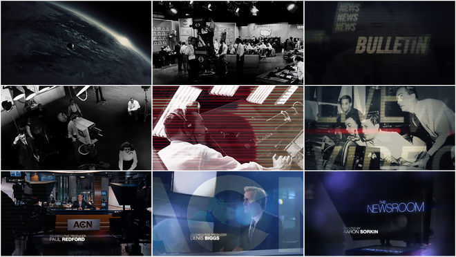
The Newsroom’s first season main titles are an insipid and uninspiring clash of ideas, characterized by dated West Wing-style vignettes of real-life newspeople and the actors who play them on TV. Neither contemporary nor classic, the sequence makes breaking news seem decidedly dull. In attempting to convey a feeling of historical importance, the original sequence (and the season two redesign) miss the mark entirely, inflating the proceedings with showrunner Aaron Sorkin’s trademark self-importance. Garnished with Thomas Newman’s cliché of a score, The Newsroom’s titles fail to do anything remotely newsworthy. In the words of Jeff Daniels: “Thrilling.”
VIKINGS
History
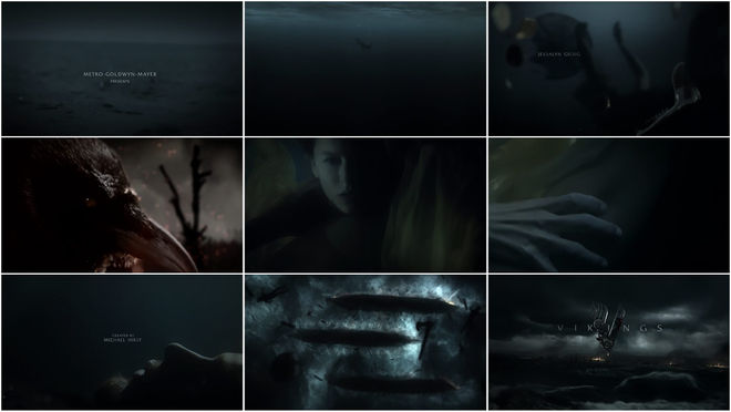
The success of the title sequence for History Channel’s new series Vikings lies in its ability to establish the appropriate atmosphere. Submerging the viewer in the aftermath of a mythic battle, it lays bare the thematic undercurrents of the show while leaving much of the barbarous detail to the imagination. Coupled with Fever Ray’s haunting dirge “If I Had a Heart,” The Mill’s sequence is enveloping, entrancing, and an excellent emotional primer for the visceral drama to follow – which, after all, is exactly the point.
Read Watch the Titles in-depth discussion with Creative Director Rama Allen of The Mill.
AMERICAN HORROR STORY: ASYLUM
FX Networks
Title Designer: Kyle Cooper
Designer: Ryan Murphy
Director of Photography: Juan Ruiz-Anchia
Title Producer: Kate Berry
Production Studio: Prologue
—
DA VINCI'S DEMONS
Starz
Director: Paul McDonnell
Art Direction: Hugo Moss, Tamsin McGee
Lead Illustrator: Nathan Mckenna
Illustrators: Maria Arnal, Vanessa Samuels
Composer: Bear McCreary
Production Studio: Huge Designs
—
ELEMENTARY
CBS
Creative Director: Simon Clowes
Producer: Ryan Robertson
Live Action Producer: Lee Buckley
Editor: Nate Park
Animator: Victor Duncan
Executive Producer: Kyle Cooper
Live Action: Prologue Films
Director: Simon Clowes
Line Producer: Lee Buckley
Post Producer: Ryan Robertson
Production Manager: Preston Clay Reed
Assistant Director: Travis Gold
Director of Photography: Benji Bakshi
1st AC: Salvatore Vega
2nd AC: Johanna Cerati
Production Designer: Andrew Clark
Production Studio: Prologue
—
HALO 4: FORWARD UNTO DAWN
Machinima.com
CG Lead: Heiko Schneck
Producer/Animator: Fabian Poss
Compositor: Csaba Letay
CG Lead/Editor: Jan Bitzer
Music/Sound Design: Michael Fakesch
Artists: Jan Bitzer, Ilija Brunck, Bashir Hamid, Marco Kowalik, Csaba Letay, Sebastian Mayer, Fabian Pross, Egbert Reichel, Heiko Schneck, Carl Schroeter, Tom Weber
Direction/Art Direction/Animation: Polynoid
—
THE NEWSROOM
HBO
Title Designer: Michael Riley
Title Designer: Denny Zimmerman
Animator: Cory Shaw
Editor: Justine Gerenstein
Production Studio: Shine
—
VIKINGS
HISTORY
Production
Director: Rama Allen
Art Director: Audrey Davis
Head of Design Production: Danielle Amaral
Head of Content: Ian Bearce
Line Producer: Rich Schwab
Production Manager: Jon Simonetta
Director of Photography: Khalid Mohtaseb
Second Unit DP: Adam Carboni
Production Studio: The Mill
DIT: Nick Midwig
Stylist: Linette Delmonico
EFX Makeup: Jacqueline Valenca
Prop: Joseph Paul Sciacca
Camera PA: Dan Stewart
PA: Chuck Simmons
Talent: Shannon Rusbuldt
Talent: Bruce Raubenheimer
Editorial
Editing Company: The Mill
Editor: Ryan McKenna
Edit Assist: Jessica Ledoux
Post-Production / VFX
Post-Production / VFX Company: The Mill
Mill Office: New York
VFX Supervisor: Westley Sarokin
2D Lead Artists: Westley Sarokin, Danny Morris
3D Lead Artists: Sandor Toledo, Vince Baertsoen
2D Artists: Suzanne Dyer, Robert Bruce (Nuke)
3D Artists: Rubem Vanderbroek, Olivier Varteressian
Colourist: Damien Van Der Cruyssen

