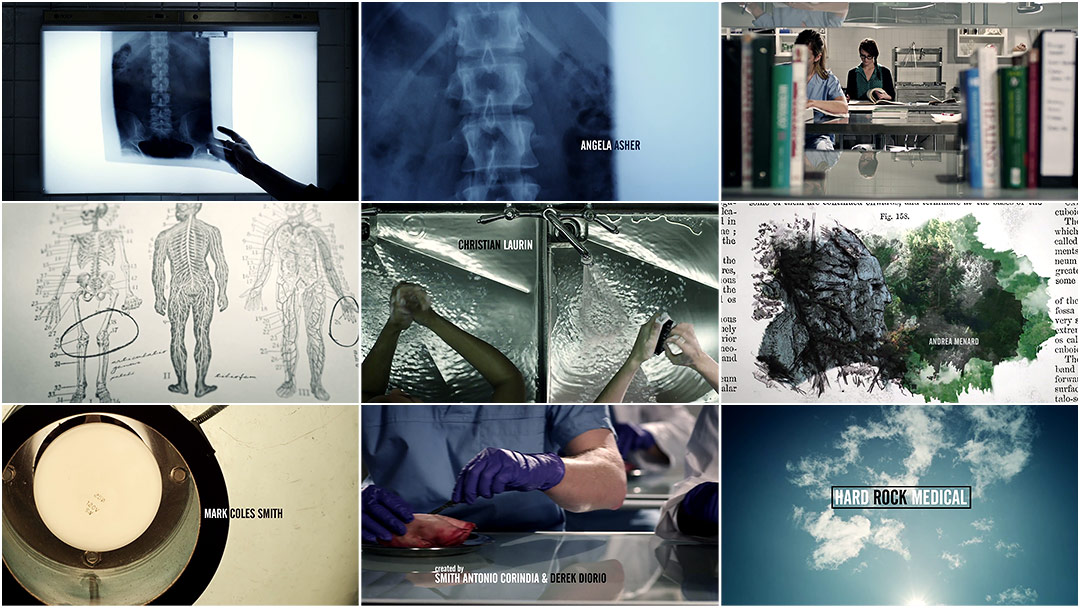
Moving fluidly from waterfalls to faucets, curricula to cumulonimbi, Jay Bond and Oily Film Company’s latest work, the opening titles to Canadian television series Hard Rock Medical, is a gorgeous example of sharp editing and deft association. The music, at once precise and warm, conducts us through the rhizomatic gestures of the piece, gliding among the macro and micro. The sequence captures the grandeur and majesty of the series’ northern landscapes while remaining rooted in the intimate details of small-town medicine, a feat sure to maintain Oily’s position as one of the best titles houses in Canada and beyond.
A discussion with Creative Director JAY BOND at Oily Film Company.
What have you been up to since we last talked, for Les Bleus de Ramville?
For the most part, I’ve been holed up in my edit suite drinking mass quantities of coffee and cutting two drama series simultaneously. But with regards to title design, shortly after the Ramville titles launched, my partner James Ransom and I heard about Hard Rock Medical, another series by the same producers that was moving towards pre-production.
Tell us about that first meeting for Hard Rock Medical.
Having worked with the client before, the first meeting was pretty straightforward and went well. The bulk of the concept was done and I pitched an outline of broad strokes, no boards, a few image samples but more or less just a breakdown of the story. It was a blend of images depicting the chronology of a med school curriculum intercut with graphic pieces from textbooks. That rough concept was accepted, so once James was available – that was early in summer of 2012 – we nailed down the details.
And how did you move through the production process?
We finessed it over that summer while simultaneously working on other projects and then did principal photography in late fall. A bit of post happened over Christmas with the bulk of the edit, graphics, and score happening this January.
How did your process on this sequence compare with the one for Ramville? What kinds of challenges did you encounter?
Usually, when a piece is finished, you look back on the process and it never seems as challenging as when you’re in the thick of it. I feel that way a little now, but this one for sure took more work. Ramville had its hiccups but mostly it was pretty straightforward in terms of its three components. For Hard Rock Medical, those three visual elements required more consideration.
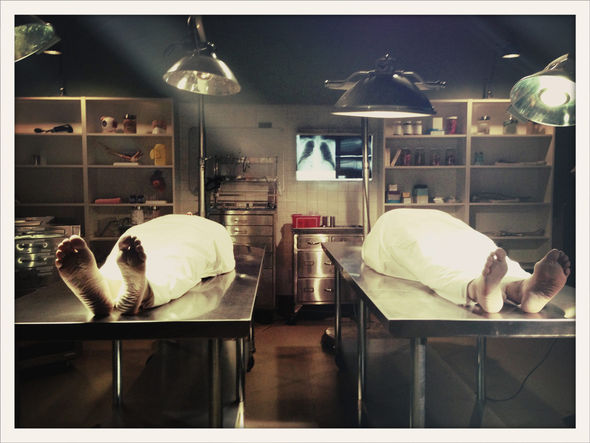
For example, the first draft of the concept had no exterior Northern Ontario shots at all. The “northern” imagery was going to reveal graphically in the medical textbooks of the students. This eventually changed to include exteriors so we ended up with the three elements: exteriors of the iconic north, the graphic component, and the medical portion. Finding the medical lab-type space that both suited our needs logistically and aesthetically was a concern since we wanted a specific look. The main unit was building a set in Sudbury but the completion date was about a week before we were scheduled to shoot, so we didn’t know whether it would suit us until the eleventh hour. In the meantime, we found a great location with some nice retro elements. Unfortunately, when they got back to us with the rental rate it wasn’t within our budget! So we eagerly waited for the set and thankfully, it turned out great.
Another budget challenge came about in trying to get several quite specific straight-down shots. Canadian dramas are not usually in the same budget league as, say, American cable shows. So the challenge becomes conceptual, too. You have to work with what you have and if you really care about the piece, you go the extra distance to make it happen. It wasn’t within our budget to get a jib for a day and even if it was, I don’t know that we could have gotten the shots we did. James and the crew orchestrated some serious gripology and built an overhead, straight-down rig from scratch. Not only did it fit within the budget but it felt pretty amazing to build a crazy rig that works really well!
"Down Rig" construction timelapse
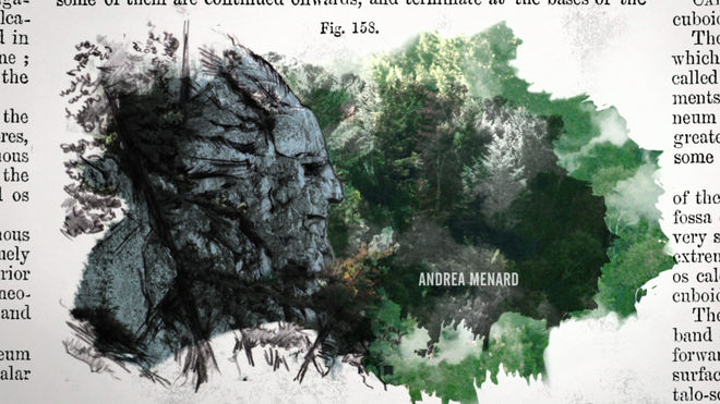
Otherwise, the challenges were mainly physical, like driving for long hours and hiking with camera gear to get to remote, scenic vistas. One of the sequences I get a lot of compliments on is the native rock face. We had finished hiking a 3km trail over pretty serious rock through Killarney Provincial Park with gear – James hauling the built RED EPIC* throughout – when we stopped for lunch in Killarney, a small town which was a few hours from closing for the season.
*The RED EPIC is a 5K sensor-based cinema camera capable of capturing 1 to 120 frames per second. It is manufactured by the Red Digital Cinema Camera Company.
We went into a diner and they agreed to keep the kitchen open for us. We saw a framed photo on the wall of the rock face. We said, “Um, excuse me, where was THAT taken?” The staff explained it was out on the water across the channel. But all the tour boats were done for the season! Luckily, an employee's husband had a boat and agreed to take us out. So over rough, choppy waters we went with the EPIC – heavily insured EPIC I might add – the gear, three crew members, and the driver. We got to a bay with slightly calmer water and saw the face and the driver cut the motor, and we drifted. We started shooting and got what we could even though the boat was moving up and down continually in the wake. We did it about four times. James did a great job getting the shot and we headed back.
Rock face transition
Then we needed to figure out how to use it. I don’t think most viewers would see the face if you just cut to it out of the blue. It needed to be introduced properly and have the eye really place it. One of the characters in the series is continually sketching so in order to incorporate that I had Crystal Beshara, the consulting artist for the series, do sketches of the face – and the tree at the end of the sequence – and Garry Tutte, the motion graphics animator, stabilized the footage and build the composite from there.
As for the graphic component, I really wanted the piece to feel connected and seamless. The graphics in Ramville were fantastic but their role was to separate the cut between the hockey elements and the memorabilia. For Hard Rock Medical, the plot of the series gives prominence to the community and the land so the goal was for those elements to tie together – to morph into each other. I sent Garry a list of sequences and assets to tie together graphically and we riffed back and forth on how best to make it happen. In the end, he did an amazing job making the transition elements flow seamlessly.
The sequence feels so tight, in terms of its editing and transitions. How much storyboarding and sketching was involved?
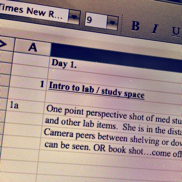
Actually, as much as we say every time in pre-production that “we’re going to storyboard this one” we still didn’t! No boards.

On set shooting
And how much of the sequence is stock footage?
In terms of stock footage that’s motion-based, the only piece of video not shot by DOP James Ransom is the cell or bacteria stuff. The assets in the graphic sequences are all scans from vintage medical books and dictionaries from the late 1800s to about 1934 with the exception of one stock still image.
Tonally, the sequence seems to pull from Danny Yount’s titles for Six Feet Under and some elements are reminiscent of Imaginary Forces’ titles for Rubicon. What were some of your influences?
Wow, well I do love both of those sequences! Six Feet Under is a classic, but unless tones were stuck in my subconscious I didn’t look or think about either of those pieces during the creation of Hard Rock Medical. I can see how the cadavers and procedural aspect of Six Feet Under could be somewhat reminiscent, though.
If anything, early on, the influence going in was from Kubrick. We really wanted to establish symmetry in this piece and use his vanishing-point feel. There’s some of that in the final but for whatever reason during the shoot we couldn’t get as many as we wanted. I just felt if the medical stuff was built around these anchoring, symmetrical shots it would have this great feel juxtaposed with the colourful, borderless feel of the exterior shots.
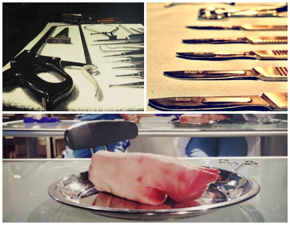
Medical props
Now, let’s address what you mentioned about Canadian production budgets. High quality title sequences are becoming increasingly common, but are still a rarity in Canadian film and television. What do you think is holding Canada back?
This is a pretty tough question to answer and I can only speculate. I know for certain it isn’t a lack of talent! There are some phenomenally talented, creative people I’ve worked with – and plenty I haven’t – in this country. I’ve seen some great Canadian sequences, like Blackstone that won last year's Gemini for titles and Durham County. There’s more starting to happen as the title design industry grows here. But yes, I’m sure it’s part production costs. It may just be an aspect of production that’s not currently at the forefront of producers’ minds.
Do you think there should be a Best Title Design category at the Oscars?
Yes, I do. It’s an art form of its own and the title sequence plays a pivotal role in setting the stage for a film. At this point though, it may take a fair amount of work to get that category to be created. We’ll see what happens.
Since title design is such a niche industry, has anything changed for you since winning SXSW’s Excellence In Title Design Award last year?
Well, first of all, just seeing our work and names alongside work from Kyle Cooper and Danny Yount – that in itself is huge to me! Then actually winning? Come on! We’ve always believed in our work but winning increased that confidence and belief. It’s helped create exposure and credibility within our community. I went into last year’s SXSW Awards with no expectations whatsoever, so the whole thing was a great experience. Hopefully it’s a launching point to a lot more projects to come.
What are some of your personal favorite title sequences, either classic or contemporary?
The classic and timeless name that is synonymous with title design: Saul Bass. His works are simple and clean but they speak volumes in terms of their design and intelligence. Grand Prix and Anatomy Of A Murder stand out for me, but there’s many more.
Otherwise, Dan Perri’s work, and Stephen Frankfurt’s To Kill A Mockingbird made up an era. Then, I think the two sequences responsible for establishing a new definitive point, when the genre got new energy and motivation, were Se7en and then Six Feet Under. Se7en opened up new doors for title designers. It’s been said many times and it still remains a groundbreaking piece of work. I relate to it a lot because that’s a methodology and workflow we believe in and employ ourselves... using raw, analog materials like film, ink drops, water, anything. And Six Feet Under did the same for television. That sequence just married everything so well: score, imagery, editing, mood. Just fantastic pieces of motion design.

