“Are you a watcher or a player?” asks the digital voice of NERVE, a crowdsourced, real-time version of Truth or Dare in app form.
How do you play? “Watchers” challenge “Players” to complete ever more embarrassing and dangerous stunts for cash. Don’t forget, snitches get stitches. The latest film from Catfish directors Henry Joost and Ariel “Rel” Schulman, Nerve follows Vee (Emma Roberts) and Ian (Dave Franco), two players who get sucked into the game and soon find their lives being manipulated by millions of anonymous watchers.
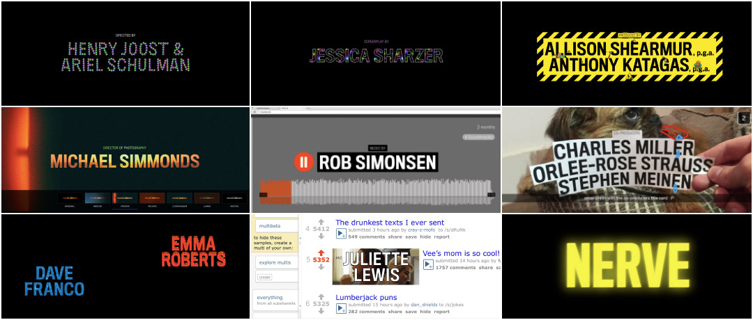
Nerve’s titular app, which increasingly seems like a plausible outgrowth of our constantly connected, fame-obsessed culture, was designed by Teddy Blanks of New York studio CHIPS. The online game figures heavily in the film, appearing not only on smartphones and computers, but manifesting itself on screen to transform movie viewers into NERVE watchers. Blanks also created the film’s end title sequence, a rapid-fire celebration of millennial screen culture that channels its credits through long-dead dotcoms, bleeding edge tech, and an apparently bottomless well of Information Age touchstones.
A discussion with Designer TEDDY BLANKS of studio CHIPS.
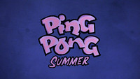
So we last spoke in 2014 about Ping Pong Summer. Things have been pretty busy for you since then – you even showed up on an episode of Girls! Could you tell us about some of the projects you’ve been involved in over the past few years?
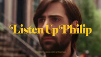
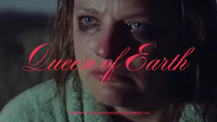
Teddy: I’ve designed a bunch of title sequences since my work on Ping Pong Summer, but a few stand out for me as having been particularly rewarding. I created a slew of fake book covers for the fictional authors in Alex Ross Perry's film Listen Up Philip, and I made a borderline unreadable title sequence in giant red script for his follow-up, Queen of Earth. I made a series of colourful geometric animations for the opening of each episode in the second season of Mozart in the Jungle.
Mozart in the Jungle (2014) season two main titles
I’ve also designed book covers for Lena Dunham’s Not That Kind of Girl, Kim Gordon’s Girl in a Band, and the 50th Anniversary Edition of Jacqueline Susann's Valley of the Dolls.
And yes, I did make my acting debut with one line in Girls. I was nervous and kept looking down at my mark, but everyone on set was patient with me and I made it through the morning.
How did you first get involved with Nerve? You also designed the look of the app in the movie, right? Did that come first?
Teddy: I’ve known [directors Ariel Schulman and Henry Joost] for years. I've always wanted to work with them. Their style is sophisticated and cool, but also has mass appeal. They have a strong sense of rhythm, which is present in both their studio features and their fantastic short form work. Especially worth seeing are a doc on John Baldessari and another about Will Shortz’s year of playing ping pong every day.
Nerve (2016) theatrical trailer
Teddy: They asked me to be the picture's “design czar.” With text and graphic elements popping up on almost every other shot as part of the app-within-a-movie, Nerve needed someone to make sure all that visual material looked like it was coming from the same place. I was initially hired to set and maintain a look for the app. The titles came later.
Could you tell us a little bit about the app design process?
Teddy: NERVE the app is an underground game in which teens carry out increasingly extreme dares while others pay to watch, film and challenge them. Each player has a Watcher count, and the players with the highest Watcher counts are the top scorers.
NERVE app introduction
Teddy: Rel and Henry originally hired an app developer to make a real app, hoping to shoot everything in camera. Unfortunately during production, they found themselves unable to make changes to the app quickly enough, and abandoned it halfway through. From then on, they shot blank phones with white marks on them so they could track the motion later.
There are the app components on the characters’ phones and laptops, and then there is the movie frame itself, which often goes into game mode, wherein a character’s Player ID and Watcher count are displayed in the corners of the screen. When a character gets a new dare, it pops up in the middle of the screen. Nerve is the rare movie where typography has a significant role in storytelling, so my goal was to make it look like something high schoolers might feasibly think was cool while also being clear and legible. Although given the popularity of Snapchat, I’m not sure those qualities aren’t mutually exclusive.
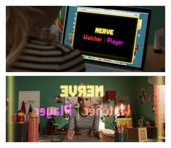
Image set: NERVE app design concepts
Teddy: The biggest challenge was keeping the look consistent. The process went a little like this: I would make a static design for an app message and send it to Luca Borghese, Nerve’s Post Production Supervisor. He would then give it to the VFX artists working on the film, who would animate it and roughly position it on the shot. Then, Luca would outsource the actual motion tracking and placement of the animated design onto the phone to a third party vendor. After going through this process for the two hundred-something graphics shots in the movie, I’d watch through the whole movie again and give notes on any inconsistencies I saw.
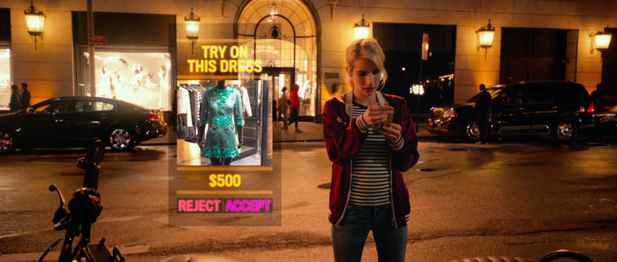
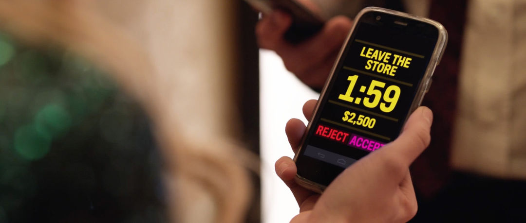
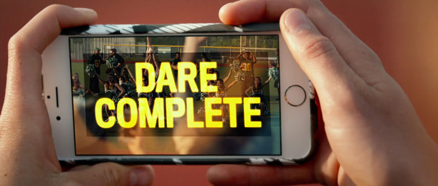
Stills from Nerve featuring Teddy Blanks' app interface
That sounds like it was a huge amount of work! What was the first conversation about the title sequence like?
Teddy: Rel and Henry wanted the titles to be bold and impactful. I had this idea that, since Nerve – and a lot of their other work starting with Catfish – is about the ubiquity of the web and its affect on our lives, the titles should somehow fully encompass the past two decades of visual language on computers, phones, and the Internet.
How did you start developing that concept?
Teddy: I just started working on it and hoped they would like it. After completing the first two title cards, I sent them this email:
I thought the best way to show you the idea was just to animate a couple of the titles. You'll get the vibe. Each title is in the NERVE font but it is made out of a different "internetty” thing. The first credit is made up of the Apple wheel of death, the second of sparkly animated gif textures. I have a ton I want to do but I want to get your blessing to keep going first, since it is time consuming.


Teddy: They replied, simply: "HOLY SHIT AWESOME KEEP GOING!!!!"
So, I did.
The sequence is a barrage of digital touchstones familiar to people who came of age online. The 3D animated type looks like it was ripped straight from a Geocities page! What elements of this sequence are you most happy with?
Teddy: The “under construction” producers card includes several animated gifs literally ripped from a Geocities page — you are correct about that. It gives me immense pleasure to watch the cartoon workers digging and hammering on the letters.
I’m also a fan of the music supervisors card, for which I took great pains to recreate iTunes’ now-defunct Cover Flow display animation. I had a blast designing the fake cover art — parodies of Fleetwood Mac, Taylor Swift, Beyoncé, and Kanye West album covers, respectively. I also made a few more of those which don’t appear in the sequence. The more covers that zoom by, the less readable the title is.
Image set: Parody album covers created for the Music Supervisors title card
Did anything else end up on the cutting room floor?
Teddy: There’s not much on the cutting room floor because I did the title sequence in order. My rule was: each title must be a reference to a website, app, game interface, or other visibly recognizable slice of screen culture, but also must be set in the same font at the same size and placement. Coming up with 20 ideas that fit this constraint was tough, and I took suggestions from Rel and Henry, from my co-workers, from a lot of smart people. I have a long list of great Internet references, but a whole lot of them were disqualified because I couldn’t use them without breaking my rule.
Speaking of rules that shouldn’t be broken, they say one should never work with kids or animals. What can you tell us about your Snapchat shoot with Omar the dog?
Teddy: Omar is our office mascot. He is the Brussels Griffon of Adam Squires, co-founder of CHIPS. I have seen Omar almost every day for the past seven years, so I’m familiar with his behavior patterns. Namely, he is either half asleep, fully asleep, or barking maniacally out the window.
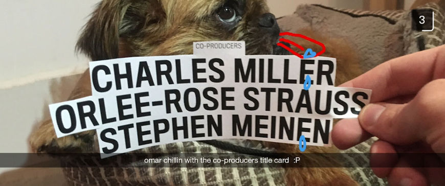
Teddy: I caught him at a crucial half-asleep moment, printed the title card out on the office printer, and held it in front of his face. Adam shined his phone’s flashlight on the dark-ish corner of the office and I snapped 10 pics before Omar could realize what was happening and start trying to lick me. It was a team effort.
How big was the production team? Which tools and software did you use to put it all together?
Teddy: I did the bulk of the design and animation work for the title sequence in After Effects. It took me a long time.
Dan Shields, my other partner at CHIPS, is a web developer. One of the titles is a screen recording of Dan opening a page he coded in Chrome’s Developer Tools, a page with the film editor’s name set in widely-spaced Comic Sans, and then quickly futzing with the code so the title is set in the correct font with the correct spacing.
Editor title card real-time process
Teddy: Dan also helped me come up with the words spelled on the Words with Friends actor card, and helped me pull screenshots of the page-flipping animation in the old version of iBooks from the vintage iPad 1.0 in our office. He is an Internet expert who spent his adolescence building computers for fun. He sits right next to me, so I consulted with him about the sequence every step of the way.
You’ve spoken in the past about the influence of title designers like Saul and Elaine Bass, Dan Perri, Pablo Ferro, and M & Co. on your work. What are some recent title sequences that you’ve enjoyed?
Teddy: The Imaginary Forces opening sequence for Stranger Things floored me. I have often mined the myriad typographic eccentricities of the ‘70s and ‘80s for my own work, and I know how hard it is to pull off without seeming kitschy. It was perfectly executed, and I wish I had done it. It is so good, it makes me angry.
I’m also a fan of Mike Perry’s titles for Broad City. He has built up an entire body of work, all variations on a theme, over three seasons.
Broad City (2014) season one and two main titles, designed by Mike Perry
What have you seen or watched lately that’s been exciting to you?
Teddy: It’s been a dull year for movies, but I still try to see things on the big screen as often as possible. I liked Hell or High Water, and I thought Swiss Army Man was a work of twisted genius. I also loved Whit Stillman’s Love & Friendship, but I’m biased because I worked on it.
Mostly I’ve been looking at old stuff, either at home or at Metrograph, the new repertory theater on the Lower East Side. I recently saw Brian De Palma’s Blow Out there – amazing titles – as well as Die Hard With A Vengeance – amazing riddles.
Blow Out (1981) title sequence, designed by Richard Greenberg
You’ve recently started directing with your partner Alex Karpovsky under the moniker The Spielbergs. What’s next for you? Do you see yourself sticking with title design or moving more towards filmmaking?
Teddy: Ideally, I’ll continue doing both! Alex and I have a great time working together, and over the past year we’ve made a handful of music videos, short films and commercials. Getting to know the realities of production has helped my film design work immensely, and having worked with so many filmmakers over the years made it easier to jump into directing. I also have side projects like the Periodic Table of Trash, which I made with my girlfriend Molly.
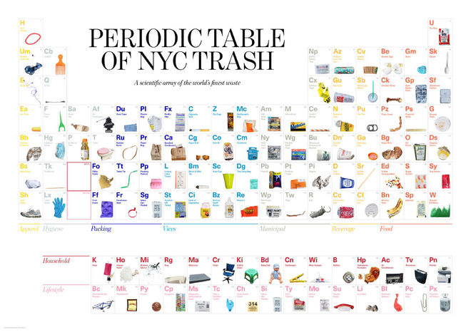
"Periodic Table of NYC Trash" by Molly Young & Teddy Blanks
Teddy: There are some exciting design projects coming up at CHIPS, and I have some TV and film ideas brewing with Alex. At the moment, both kinds of work seem to be feeding one another.

