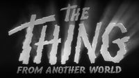
The Golden Age of the American B-Movie Title Sequence
Part 3: Out With a Bang
The ’70s and ’80s were both the best and the worst of times for B movies. Having exited the golden ’60s with a loyal drive-in audience and full license in the absence of the Motion Pictures Distributors Association of America (MPDAA), the B industry pushed on at full throttle. No subject was too depraved or taboo: cannibals, serial killers, vengeful vixens and all genera of counterculture deviance were welcome under the B-movie tent.
For its many flaws, the Production Code had the unintended effect of governing not only the substance of low-budget films but their production value; its rigid guidelines forced even the lowest-budget fare to maintain a baseline façade of professionalism. But, sex and violence being what they are, and with censorship of marginal concern, little plot or investment was needed to turn a profit, and so decorum fell by the wayside.
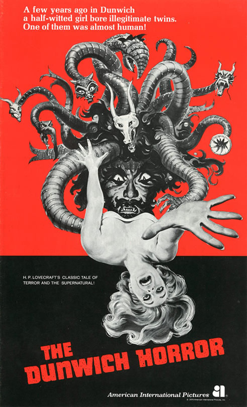
Poster for The Dunwich Horror (1970) and various pressbook and publicity materials
While the B-movie industry at large spiraled into a feedback loop of its own making, there were those who exploited the exploiters to kickstart their own careers. Steven Spielberg, David Cronenberg, George Lucas, Brian de Palma, Francis Ford Coppola, and Sam Raimi are a few of the many directors who gamed the system in the ’70s, taking advantage of established B-movie conventions and a built-in audience, forging a unique independent film movement grounded in both American folklore and the European New Wave cinema that influenced them in the ’60s.
Likewise, maturing social concerns like civil rights and feminism forged an uneasy alliance with the B industry, broadcasting their respective agendas to a new generation of disenfranchised youth – provided, of course, that tops came off along the way.
Unilaterally, the 1970s saw B film reject its fantasy roots and fully commit itself to exposing the raw nerves of America's institutions. Along with that came a rejection of the established Hollywood model, and so title sequences – often associated with big-budget film production – were largely demoted to their legal function, devoid of intentional design.
Title design took another hit in the late ’80s, when advancements in offline editing promoted editors to the task, with basic font options and digital effects at their disposal. The graphic nuance and visual bravado of mainstream pioneers like Saul Bass and Maurice Binder in the '60s was largely retired; functional titles became king.
There were, of course, subgenres still in need of a voice, and a new generation of postmodern designers who – like the Spielbergs and Coppolas of the '70s – brought their own sensibilities and influences to the craft. And while their efforts would largely remain localized, they would nevertheless help define the last great era of American counterculture cinema.
The Open Road
Two-Lane Blacktop (1971)
You'd be forgiven for mistaking indie darling Monte Hellman's Two-Lane Blacktop for any of the several dozen road movies to come out of the early ‘70s, when the romance of cross-country travel appealed to a new generation of restless teens and their hand-me-down Chevys. And its similarities are many, though Hellman's unique direction style and deep investment in his subject matter set it apart from its poorly-crafted contemporaries.
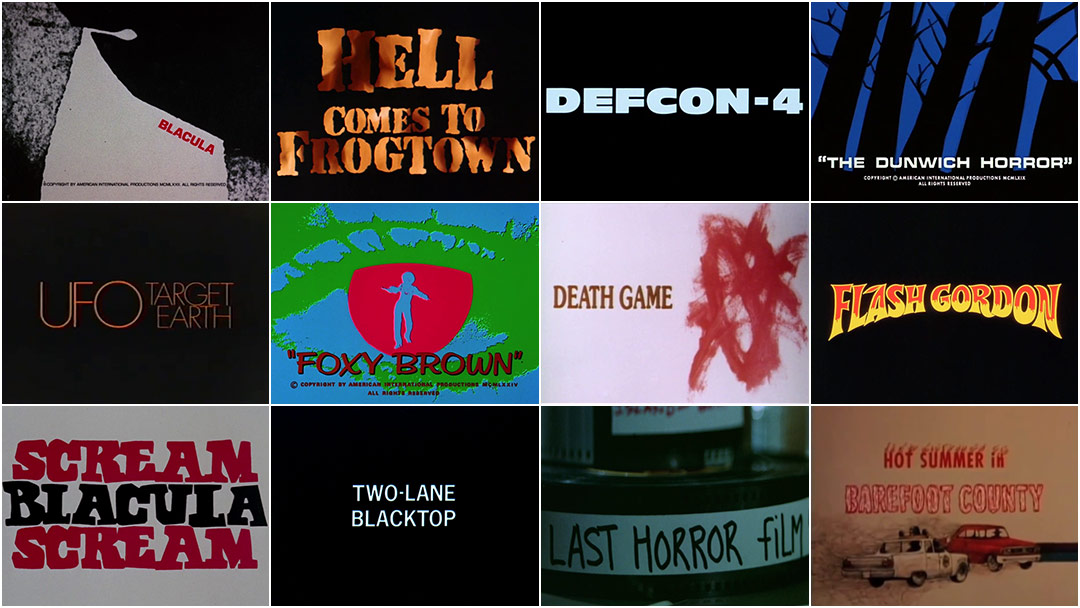
Two-Lane Blacktop (1971) opening title sequence
As with the film, its titles are reduced to the essentials: the open road and the sound of James Taylor's '55 Chevy purring away as he ditches the cops in search of new mischief.
Hot Summer in Barefoot County (1974)
Hot Summer in Barefoot Country (1974) opening title sequence with title art by Susan Alvarez
Hot Summer in Barefoot County would be just like any other cops n' robbers caper to come out of the '70s were it not for its female antiheroes and its setting in the deep south, feeding into a curious new B-movie trend that placed all-female ensemble casts in unfortunate predicaments, exemplified in films like The Big Doll House (1971), Invasion of the Bee Girls (1973) and Switchblade Sisters (1975).
Designed by Susan Alvarez, its title sequence re-enforces these themes by pairing a twangy country score by W. Henry Smith – known exclusively for his trucker-themed soundtracks – with graphic illustrations of scenarios from the film, done in a style so esoteric and lo-fi as to border on folk art.
Sweet Revenge
Blacula (1972) and Scream Blacula Scream (1973)
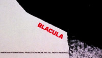
Sandy Dvore lends his talents to William Crain's Blacula, building what could be described as a soulful Pink Panther homage.
Blacula (1972) opening title sequence designed by Sandy Dvore
It features a vampire bat on the hunt for blood – preferably of female origin – as he works his way through a labyrinth of close-up ink textures. Its bold black, white, and red palette is reminiscent of the graphic minimalism he explored in The Dunwich Horror here giving his colors a more symbolic – and arguably, social – weight.
Scream Blacula Scream (1973) opening title sequence designed by Sandy Dvore
Dvore returns to title Scream Blacula Scream in 1973. Here he maintains the palette he established in the first film, but evolves both his graphic style and animation techniques, giving the sequence a pop-art inspired presentation, and Blacula himself an iconic Warhol-esque presence.
Foxy Brown (1974)
Perhaps one of the most ambitious sequences of the '70s, in B-movies or otherwise, the bombastic titles to Jack Hill’s Foxy Brown employ almost every trick in the title design book, from image rotoscoping and solarization to multi-layered optical animation and colorization. As with Iginio Lardani's spaghetti western titles in the '60s, its presentation is a deliberate and unsubtle homage to Maurice Binder's early James Bond titles, lending breakout star Pam Grier credibility by association while maintaining a controlled aesthetic all its own. However, unlike Binder’s treatment of women as graphic backdrops for his titles, here the format is flipped on its head, with Foxy Brown front and center as an independent, sexy female lead.
Foxy Brown (1974)
Few title sequences before or after have gone so far to establish a film's lead character as an iconic brand, though Quentin Tarantino made a similar – if not far more subdued – effort in his unofficial 1997 sequel, Jackie Brown.
Buckets of Blood
The Dunwich Horror (1970)
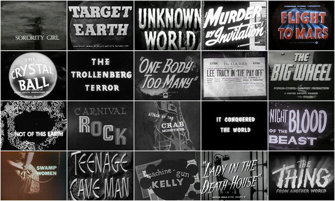
As with B-title legends Paul Julian (Swamp Women, 1956) and Bill Martin (Carnival Rock, 1957) in the '50s and '60s, title designer Sandy Dvore cut his teeth working with legendary B-producer Roger Corman, who first courted him after seeing his titles for Otto Preminger's Skidoo in 1968.
The Dunwich Horror (1970) opening title sequence designed by Sandy Dvore
However, unlike Julian and Martin, whose traditional cel animation backgrounds are evident in their sequences, Dvore's style is more reminiscent of graphic title designers like Saul Bass and Iginio Lardani. The Dunwich Horror is his first excursion into graphic animation, cleverly blending themes from the film through scale and image morphing, set in a deep black and blue palette and scored by exotica maestro Les Baxter.
Death Game (1977)
Death Game (aka The Seducers) (1977) opening title sequence designed and illustrated by Mary Meacham
Continuing the trend to migrate fantasy into the domain of realism, Death Game, aka The Seducers claims to be a real-life account of a bizarre suburban murder and blackmail scheme, with dubious connections to the event that inspired it.
Regardless, its title sequence fully embraces the premise, pairing children's drawings with an upbeat, Moog-driven jingle exhaling the virtues of fatherhood, lending an innocence to the story in contrast to the film itself. Its deliberate lack of irony and uncomfortable zoom-ins to innocuous details in the drawings artfully crafts an unsettling message that carries through well into the narrative.
It was designed and illustrated by MGM titling veteran Mary Meacham, who went on to title several films and television shows in the ’70 and ’80s before moving on to Disney films like Bolt (2008) and Tangled (2010).
The Last Horror Film (1982)
The Last Horror Film, aka FANATIC, aka Love to Kill, is likely one of the most spirited and bizarre B-movies to ever be produced.
The Last Horror Film (1982)
It concerns a sleazy cab driver, Vinny, who is obsessed with horror film actress Jenna Bates, whom he travels to the Cannes Film Festival to stalk. What follows is a psychedelic mash-up of Fellini-esque character vignettes and meta-film references, most certainly filmed without permits or – at times – a script.
In keeping with the meta-premise of the film, its main title sequence finds Vinny hunched over a Moviola in a cutting room, piecing together the film itself. It's an in-joke that only fully pays off in the last few minutes of the film, but it also effectively sets up its central themes and the obsessive nature of its protagonist.
A New Breed of Sci-Fi
UFO: Target Earth (1974)
Studios and filmgoers in the '70s overwhelmingly favored realism over fantasy, to the extent that once-proud genres like science fiction were forced to bend to this new vérité format for survival. Nowhere is this more evident than in UFO: Target Earth, which blurred the lines between fact and fiction long before reality television and faux-documentaries came into vogue the '90s.
UFO: Target Earth (1974)
Its title design is a reflection of this genre conflict, combining a formal presentation of the film's title with “archival” UFO footage to substantiate its thesis.
Flash Gordon (1980)
With a budget of $20 million, Flash Gordon isn't a B-movie in the traditional sense, though its camp treatment and subsequent rise to cult status – no doubt assisted by its lower-budget counterpart Flesh Gordon in 1974 – have assigned it an enduring B label. Its titles do little to discourage the association, combining pulp typography and comic book illustrations with computer-assisted laser FX and transitions, all timed to a stadium-rock score by Queen.
Flash Gordon (1980) opening title sequence designed by R/Greenberg Associates
Designed by Richard Greenberg under the banner of his new titling & advertising firm R/Greenberg Associates, their technical sophistication offer an early glimpse into titling trends that would come to dominate the '80s blockbuster landscape, mostly by his own hand.
Def-Con 4 (1985)
Def-Con 4 is a serious film. Well, as serious as a mid-'80s film about a post-WWIII nuclear apocalypse can be. And despite its budget and performance shortcomings, it does its best to hold its own.
Def-Con 4 (1985) opening title sequence designed by Ernest D. Farino
Its greatest achievement, however, is likely its marketing campaign, which sold the film as an A-grade blockbuster well beyond its modest $1.1 million budget.
Complicit in this was its title sequence, which uses letters from the title itself as a larger-than-life backdrop for the credits. Designed by ‘80s titling heavyweight Ernest D. Farino (The Terminator, 1984, The Abyss, 1989, Terminator 2, 1991) and scored by horror maestro Christopher Young, it effectively sets the tone of the film without exposing its many shortcomings.
Hell Comes To Frogtown (1988)
While involved title sequences in B movies became increasingly rare through the '80s, a late exception is Farino's design for Hell Comes to Frogtown. It channels the early pacing of Bass and the duotone graphic sensibilities of Lardani, whose iconic Spaghetti Western titles are exploited here to draw parallels between a post-apocalyptic America and the Wild West. This sentiment is driven home at the closing of the sequence, which frames protagonist Sam Hell – played by wrestling newcomer Rowdy Roddy Piper – in an old-fashioned WANTED poster.
Hell Comes To Frogtown (1988) opening title sequence designed by Ernest D. Farino
By the late 1980s, the efforts of breakout B-film directors like George Lucas and Steven Spielberg had paid off, vaulting them to A-list status and lending credibility to B-movie genres like science fiction and action-adventure, and setting the template for summer blockbusters to this day. Likewise, no-budget realism as pioneered in B films in the '70s gave way to the independent and art film movements of the '80 and ‘90s, leaving the B-movie industry with an identity crisis, unable to cash in on the very genres it helped to mold.
This, combined with the advent of content-hungry cable television, the decline of drive-in culture, and the reestablishment of moral standards in a post-liberated America all but relegated the B industry to obscurity, largely devoid of social and cultural merit.
It was of little consequence to title designers who, unlike the B movies they serviced, had no genre allegiance. While they could no longer find creative refuge there, title design at large would benefit from their efforts. Indeed, the migration of whole genres into the Hollywood spotlight brought with it the vaudeville potential of their titles, which in turn propagated out into the industry as a whole. And so while B titles are best known as markers of their time and place, perhaps their greatest legacy is their enduring ability to pump up their films through raw showmanship and remarkable ingenuity.
START AT THE BEGINNING with Part One
They Came From Within:
B-Movie Title Design of the 1940s & 1950s
Support for Art of the Title comes from


